Rather Both 2xOTF $34
Designers: Ricardo Marcin, Erica Jung
http://www.myfonts.com/fonts/pintassilgo/rather-both/
- Rather Jazzy, Rather Loud: a family of two quite distinct fonts that perform together handsomely well. Both fonts include 2 versions for each letter, easily reachable through keyboard upper and lower keys. They also come packed with Contextual Alternates functionality to instantly cycle the alternates, providing a realistic handcrafted feel: just turn on the feature in any OpenType savvy application and let the music sound. Rather Loud brings yet another cool feature: lots of interlocking pairs that will add that nice extra twist your projects sometimes ask for. Trigger the discretionary ligatures feature button (OpenType savvy applications needed!) or pick up your choices through a glyphs palette or character map. Jazzy? Loud? I'd Rather Both, for sure!
HS Almidad Arabic, Persian, Urdu & Kurdish $229
5 OTF OpenType Fonts with WebFonts | Designer: Hasan Abu Afash
http://www.myfonts.com/fonts/hibastudio/hs-almidad/
- HS Almidad has been started in coincidence with my designing logotypes consisting of triangle geometric, looking shape and overall structure. After designing several words, I thought of using the design concept of this logo to develop a geometric Kufi font. All letters of this typeface family were conceived with suitable and coordinated dimensions to create five weights: Thin, Light, Regular, Medium and Bold: They support Arabic, Persian, Urdu and Kurdish languages. With a triangle look, this font is a simple and creative addition, which can be useful for book titles and variety of other geometrical constructions projects. It brings new design concept to enhance beauty and harmony and enrich our previous geometrical font contributions, which started with the release of HS Alhandasi, HS Almohandis and HS Alfaris from HibaStuido.
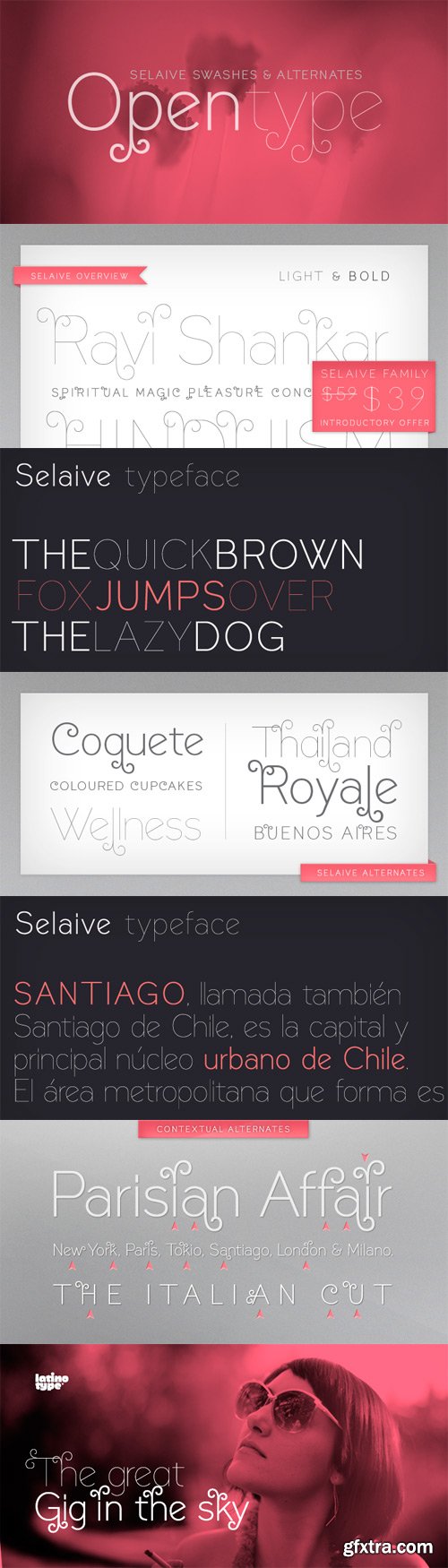
Selaive Font Family
Selaive is a geometric typeface that has an air of rebelliousness. The thick and thin versions give you the chance to play a coquettish and seductive game. Its flourishes make it a very dynamic typeface when composing a text, ideal for those who want to add a personal and glamorous touch to their compositions. Selaive is an excellent choice for fashion magazines, logotypes and shops. Languages include: Basic Latin, Western European, Euro, Catalan, Baltic, Turkish, Central European, Romanian and Pan Africa Latin.
OTF | 2 Fonts | JPEG Preview | 4 Mb RAR
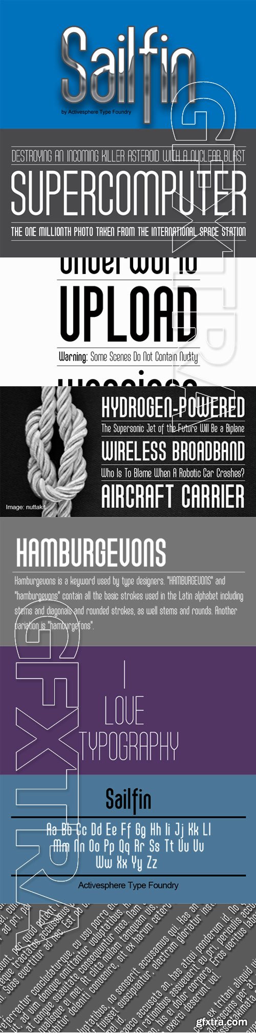
Designers Ronnie Dela Cruz
- Sailfin is a condensed geometric typeface, and works best in text and display applications, such as headline, posters, signage, magazine, product branding, corporate branding, logos and titles. Several alternate characters are included in this typeface.
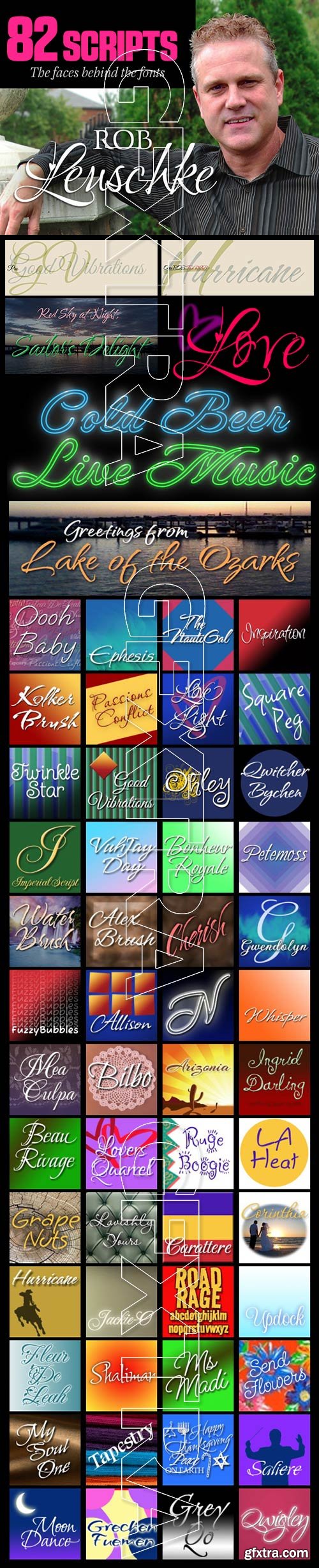
- Rob Leuschke: A former lettering artist at Hallmark Cards, Rob Leuschke now has his own thriving design businesses, Alphabytes and the new TypeSETit. Growing up in St Charles, Missouri, where he still lives, Rob showed great artistic promise at an early age. He earned a BFA in graphic design at the University of Missouri at Columbia. After graduation, his stint at Hallmark Cards gave him the opportunity to learn from and work with some of the best lettering artists in the industry. Rob struck out on his own in 1987 and now boasts a long list of clients from all over the world. Rob has created over 250 custom typefaces, and his work has been exhibited in New York. Ambiance BT is Rob’s first typeface published by Bitstream, with more to follow. Rob Leuschke enjoys continued success as a lettering artist and graphic designer with emphasis on typography and hand-lettering. His work consists of design work for a number of products in multiple industries— social expression, advertising & visual communications, and multimedia. He graduated in 1981 with a Bachelor’s of Fine Arts (BFA) degree from the University of Missouri – Columbia with concentration in illustration and graphic design.


Helvetica Ultimate Collection 475$
Helvetica | Helvetica World | Helvetica Neue
This typeface was initially released as Neue Haas Grotesk, and was designed in 1957 by Max Miedinger for the Haas’sche Schriftgiesserei (Haas Type Foundry) in Switzerland.
The name was changed to Helvetica (an adaptation of Helvetia, the Latin name for Switzerland) by Walter Cunz when D. Stempel AG, a major stockholder in Haas, reworked the design for Linotype GmbH in Frankfurt, a major stockholder in Stempel. The Mergenthaler Linotype Company in New York, then a major stockholder of Linotype GmbH, adopted the design, and it rapidly became the most popular sanserif in the world, replacing Futura.
Helvetica is designed as a strong central series, with condensed and extended forms and extreme weights adapted and added later, a system which suited Linotype mechanical limitations and marketing philosophy, but which resulted in a family of weights that were not as well coordinated as they might have been.
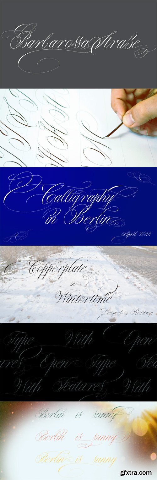
Copperlove Font
Copperlove was born during a very long and hard wintertime in Berlin. This font is based on Giuseppe Salerno’s Copperplate calligraphy. Oblique nib and sepia ink were the tools used to create this sublime english typeface. There are also many opentype features like alternates and beautiful swashes.
OTF | 1 Font | JPEG Preview | 6.7 Mb RAR
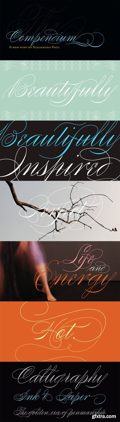
Compendium Font
Compendium is a sequel to my Burgues font from 2007. Actually it is more like a prequel to Burgues. Before Louis Madarasz awed the American Southeast with his disciplined corners and wild hairlines, Platt Rogers Spencer, up in Ohio, had laid down a style all his own, a style that would eventually become the groundwork for the veering calligraphic method that was later defined and developed by Madarasz. After I wrote the above paragraph, I was so surprised by it, particularly by the first two sentences, that I stopped and had to think about it for a week. Why a sequel/prequel? Am I subconsciously joining the ranks of typeface-as-brand designers? Are the tools I build finally taking control of me? Am I having to resort to “milking it” now? Not exactly. Even though the current trend of extending older popular typefaces can play tricks with a type designer’s mind, and maybe even send him into strange directions of planning, my purpose is not the extension of something popular. My purpose is presenting a more comprehensive picture as I keep coming to terms with my obsession with 19th century American penmanship. Those who already know my work probably have an idea about how obsessive I can be about presenting a complete and detailed image of the past through today’s eyes. So it is not hard to understand my need to expand on the Burgues concept in order to reach a fuller picture of how American calligraphy evolved in the 19th century. Burgues was really all about Madarasz, so much so that it bypasses the genius of those who came before him. Compendium seeks to put Madarasz’s work in a better chronological perspective, to show the rounds that led to the sharps, so to speak. And it is nearly criminal to ignore Spencer’s work, simply because it had a much wider influence on the scope of calligraphy in general. While Madarasz’s work managed to survive only through a handful of his students, Spencer’s work was disseminated throughout America by his children after he died in 1867. The Spencer sons were taught by their father and were great calligraphers themselves. They would pass the elegant Spencerian method on to thousands of American penmen and sign painters. Though Compendium has a naturally more normalized, Spencerian flow, its elegance, expressiveness, movement and precision are no less adventurous than Burgues. Nearing 700 glyphs, its character set contains plenty of variation in each letter, and many ornaments for letter beginnings, endings, and some that can even serve to envelope entire words with swashy calligraphic wonder. Those who love to explore typefaces in detail will be rewarded, thanks to OpenType. I am so in love with the technology now that it’s becoming harder for me to let go of a typeface and call it finished. You probably have noticed by now that my fascination with old calligraphy has not excluded my being influenced by modern design trends. This booklet is an example of this fusion of influences. I am living 150 years after the Spencers, so different contextualization and usage perspectives are inevitable. Here the photography of Gonzalo Aguilar join the digital branchings of Compendium to form visuals that dance and wave like the arms of humanity have been doing since time eternal. I hope you like Compendium and find it useful. I'm all Spencered out for now, but at one point, for history’s sake, I will make this a trilogy. When the hairline-and-swash bug visits me again, you will be the first to know.
OTF | 1 Font | JPEG Preview | 3.9 Mb RAR
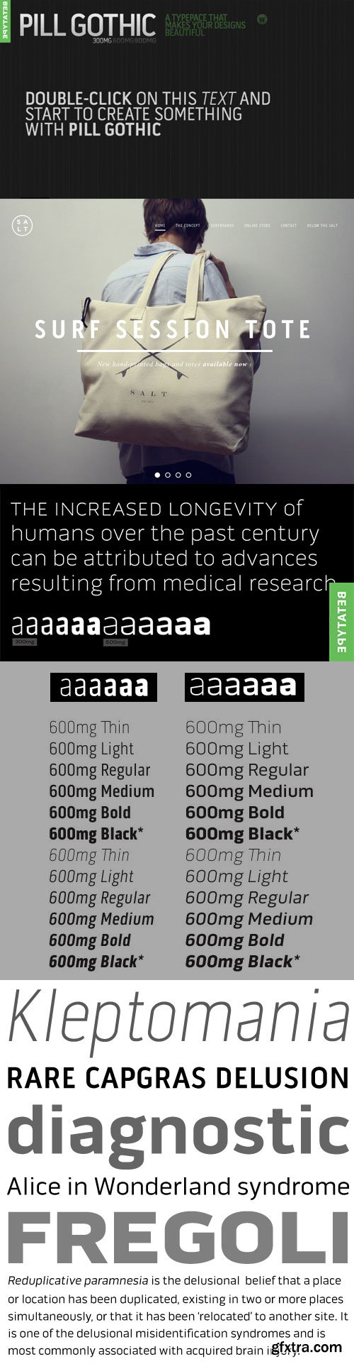
Betatype - Pill Gothic 300mg 600mg
[ The Newest & Largest Gothic Character Set ]
24xTTF Fonts | $700 | 24 MB
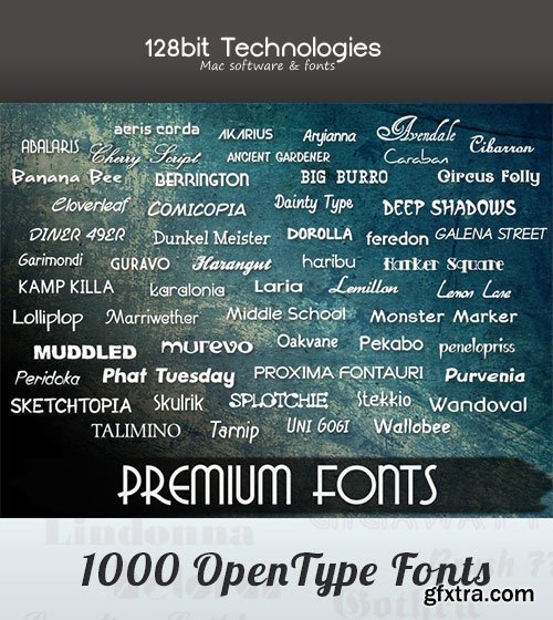

1,000 Premium Mac Fonts for Commercial Use - 128bitTech
1007 OTF Open Type Fonts work for Mac & PC | 32 MB
http://www.128bittech.com/premium_fonts.html
http://www.inkydeals.com/deal/1000-premium-fonts/
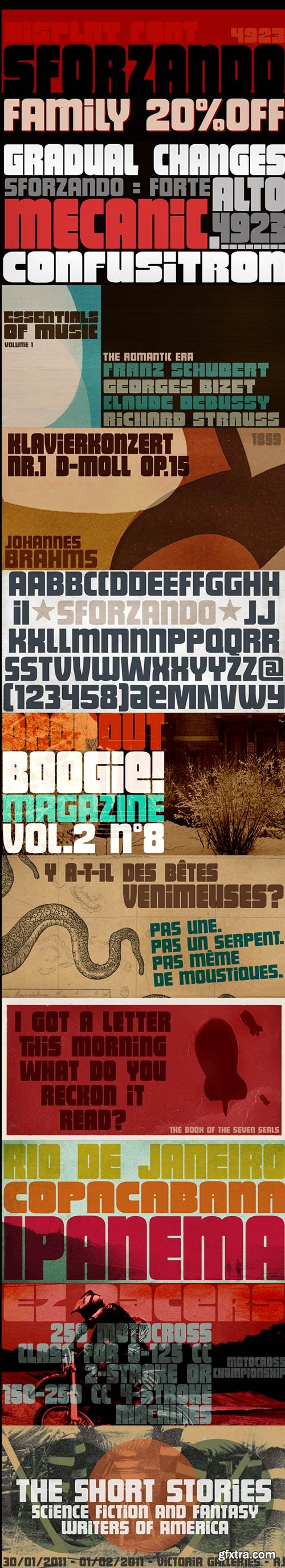
- Sforzando is a striking display font available in three variations. Each one is an all caps alphabet that brings two alternatives for each letter, amplifying your design choices. It comes with a small but handy set of alternates that help create that special, unusual touch. Vigorous and versatile, Sforzando is an excellent option for a wide range of applications.
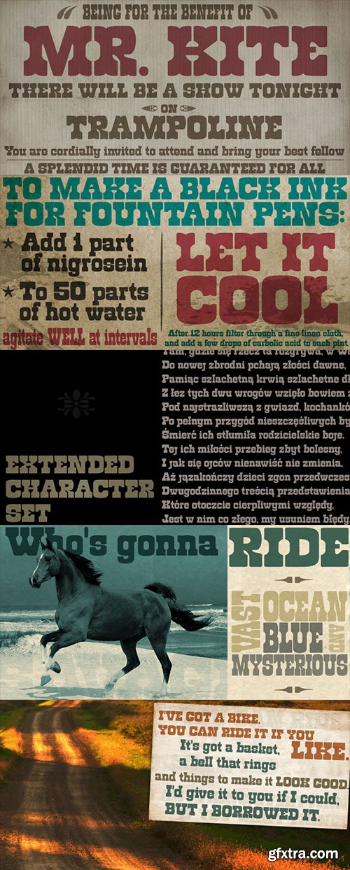
Roadway Font Family 3xOTF $45
Designers: Ricardo Marcin, Erica Jung
http://www.myfonts.com/fonts/pintassilgo/roadway/
- Roadway is an original typeface with an antique accent, inspired by Clarendon woodtypes from late 19th century. It comes in three matching varieties, with extended character sets and a lot of personality.
Vitrines Font Family 3xOTF $40
Designers: Ricardo Marcin, Erica Jung
http://www.myfonts.com/fonts/pintassilgo/vitrines/
- Vitrines is a digital and extended version of a charming alphabet featured in a 1913 book devoted to window signs and show cards. This version was carefully developed to preserve the original hand lettered look and feel. It includes a bold weight and a set of pattern tiles to adorn your compositions. A note about the pattern font: in order to create even patterns, be sure to set the line spacing the same size as the font and set no spaces before or after paragraphs.
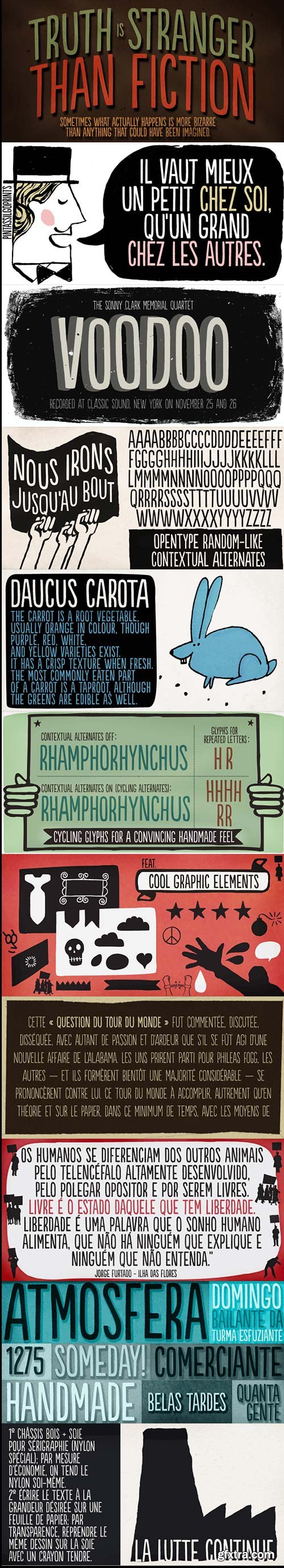
- Populaire is a hand-drawn font that mimics true handcrafted lettering. Counting 4 glyphs for each letter, the laborious kerning table ensures that the glyphs are really exchangeable. Yet, there’s a cool set of ornaments and a kind-of-magic OpenType feature. When the Populaire font is used in OpenType-savvy applications, its Contextual Alternates feature produce a striking random-like effect on glyphs distribution, achieved by cycling through alternates. When not using the Contextual Alternates feature, you can still pick the alternates in the Glyphs palette or use the alternates available from the keyboard upper and lower case.. Inspired by the electrifying posters from May 1968 by Atelier Populaire, this dynamic font is flexible enough to bring freshness and energy to a wide range of design applications. Used in the titles for the 2012 movie Life of Pi.
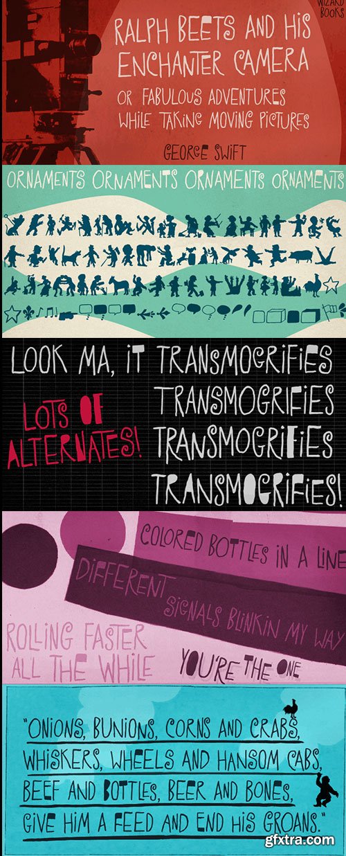
Transmogrifier OTF $35
Designers: Ricardo Marcin, Erica Jung
http://www.myfonts.com/fonts/pintassilgo/transmogrifier/
- Inspired on Cuban posters by the talented and prolific graphic artist Eduardo Munoz Bachs, Transmogrifier was hand painted with a thin brush, using loose, fast strokes. This font is packed with lots of contextual and stylistic alternates that automatically transmogrifies the letters as you write, when using opentype savvy programs. It’s also possible to pick the alternates by hand and set the text the way you like better. The choice is yours, and there are really plenty of alternates to choose from and create original handlettered-looking designs. The font also brings a rough set of pictures based in charcoal sketches from Shniedewend & Lee Company, 1888. These were painted with the same thin brush as the letters, making it a natural complement. So let the transmogrification begin!
Sabotage Font Family 3xOTF $46
Designers: Ricardo Marcin, Erica Jung
http://www.myfonts.com/fonts/pintassilgo/sabotage/
- Sabotage is inspired by the iconic Vertigo movie poster by Saul Bass. It is a bold all-caps font that fits a wide range of eye-catching design projects surprisingly well. Check it out! Sabotage offers two versions for each letter, stored in upper- and lower-case slots. When turned on, its contextual alternates feature will instantly alternate these glyphs, preventing double letters from displaying the same letterform while boosting the nice handlettered feel of the typeface. The font is also loaded with a set of stylistic alternates and a couple of discretionary ligatures for even more flexibility. Sabotage is available in 2 flavours, solid and not-that-solid. The family also counts a cool complementary picture font which sort of draws inspiration from the minimalistic - but always striking - book-cover illustrations of Dick Bruna.
- Nova Horst is an amplified version of Horst, a highly original font (MyFonts Rising Star) based on etchings by the extraordinary artist and printmaker Horst Janssen.
- Nova Horst keeps all the amazing wilderness of the original font, while enriched with sharp OpenType programming, plus a whole new set of alternates, a handy set of ornaments and loads of cool unpredictable overlapping glyphs. Language support was also expanded.
- Now there are 5 sets of letters, 2 sets of numerals and a robust set of discretionary ligatures. OpenType functionalities now include an extremely playful Contextual Alternates feature and also Discretionary Ligatures and Stylistic Alternates.
- Nova Horst is an energizing blend of eccentric characters, cool OpenType features, loads of alternates and a meticulous kerning table. But be warned: as the original font, this one is quite addictive!
A quick roadmap:
- All features turned off: you can choose the different letterforms stored on upper- and lowercase sets. There are no overlapping letters.
- Contextual Alternates turned on: you get alternating characters from 4 sets of glyphs, with loads of overlapping letters, all managed by a carefully handcrafted kerning table. The result is a very cool random effect on glyphs distribution.
- Discretionary Ligatures turned on: now some additional glyphs enter the scene. There are more than 60 ligatures glyphs which substitute pairs of letters for some extra-coolness
- Stylistic Alternates turned on: access the counterless glyphs from the Stylistic Alternates set.
- Use each feature alone or mix them up for added boldness. Gorgeous extravaganza guaranteed!
Tremendous Font Family 3xOTF $44
Designers: Ricardo Marcin, Erica Jung
http://www.myfonts.com/fonts/pintassilgo/tremendous/
- Strong and somewhat rough but absolutely warm-hearted, this Tremendous family is quite versatile and will find the right tone to deliver your message in a nice way. It can be friendly, it can speak out loud, it can be almost serious. It just cannot go unnoticed! Each font weight brings 2 slightly different options for each letter , which is cool for a more uneven look. Pick your choices through the keyboard or just turn on the OpenType ‘contextual alternates’ feature to instantly cycle these alternates. For tremendous people.
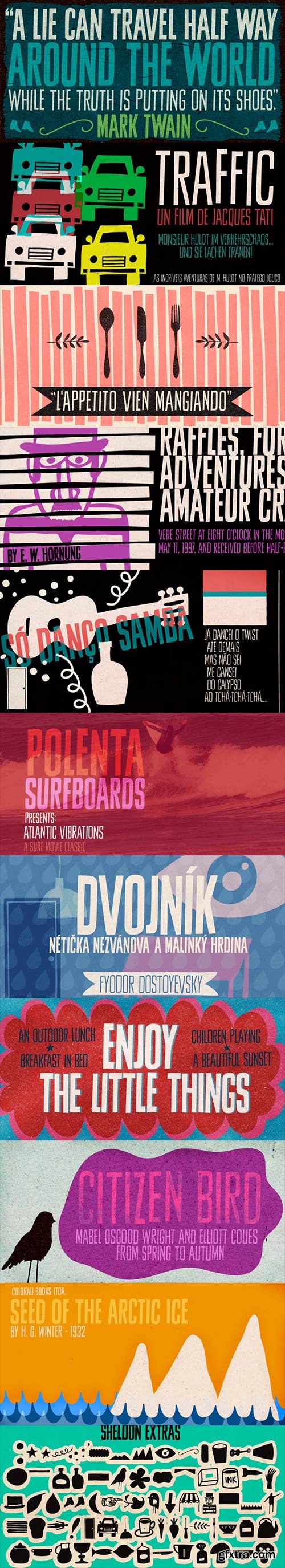
- Sheldon draws inspiration from the beautiful and eloquent posters of Polish graphic artist Marian Stachurski. Generously sprinkled with stylistic oddities, this is the perfect typeface for having some cool typographic unevenness without losing the ever-handy sans-serifness. Sheldon is a unicase font, but holds different characters on upper- and lower-case slots for a more consistent handcrafted feel. Its OpenType Contextual Alternates feature can manage to instantly alternate the glyphs - which can be great also for webfont usage! The family includes 3 handy weights, so it can accommodate numerous typographic tasks. It also brings a very cool picture font, which charmingly completes this useful and visually striking font family. Have fun!
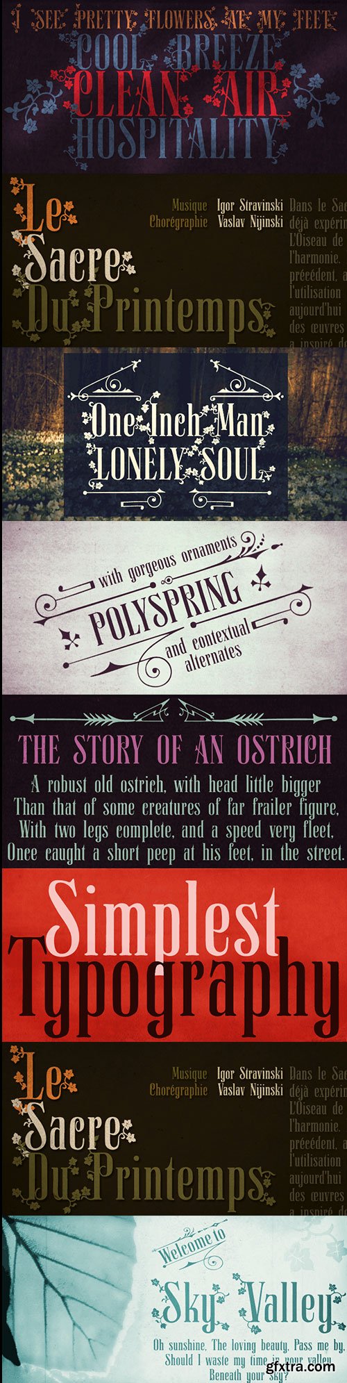
Polyspring OTF $29
Designers: Ricardo Marcin, Erica Jung
http://www.myfonts.com/fonts/pintassilgo/polyspring/
- Polyspring is a handcrafted serif display font, with a cool flowery flair. It was hand-drawn based on Italia Condensed typeface from Keystone Foundry from circa 1906. Loaded with stylish ornaments and flourishing alternates for all its letters and numbers, this font is a terrific toolbox for display purposes. Yet, it has the superpower of changing the first and last letters in words to its germinated alternates at the click of a button, thanks to the smart OpenType programming. Please note that this feature will only work in OpenType savvy applications. Check it performing live on the sample text below: just click on the Advanced Typography option, located next to the sample colors options (look for an icon showing “ff”), and check the option “swash”. Very cool, isn't it? Happy blooming!
Polygraph Font Family 2xOTF $39
Designers: Ricardo Marcin, Erica Jung
http://www.myfonts.com/fonts/pintassilgo/polygraph/
- Inspired on posters by the extraordinary polish artist Leszek ?ebrowski, Polygraph is a highly unusual face. Packed with eccentric alternates, it is an all-caps font with four exchangeable variations for each letter. These alternates are programmed to cycle when the font is used in OpenType-savvy programs, creating a random effect on glyphs distribution. The resulting pieces are truly outstanding, with an audacious handmade twist. To achieve this, just turn on the contextual alternates feature and play – you can easily try different glyphs sequences by adding spaces before words. When you need a more well-behaved look, but still with a subtle hand-drawn flair, turn off the contextual alternates and set text in uppercase. Polygraph comes in two weights, for added flexibility. But be warned: it’s quite addictive!
- Nanquim is a versatile font, available in three sketchy options. At display sizes the line art is very eye-catching. At smaller sizes it turns out like textured faces. Always with a pleasant handmade feel. Nanquim characters were hand drawn with pen and India ink on film, like we use to do when preparing artwork for screenprint. Hope you enjoy!
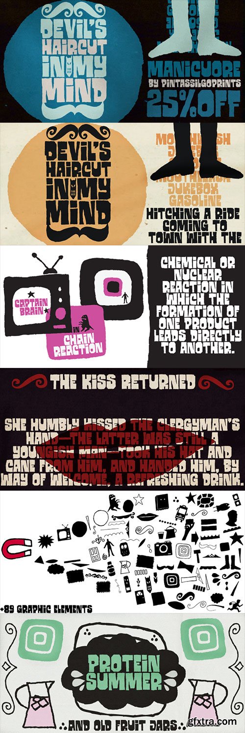
- Manicuore is a hand-drawn typeface inspired by Italian movie posters by the prolific movie poster artist Symeoni (a.k.a. Sandro Simeoni). Being a talented and skilled painter, portraitist and illustrator, Symeoni enjoyed a long and fruitful career and was remarkably productive during the sixties and seventies. He counts over 3,000 works to his credit, which truly fed the imagination of several generations.
- This all-caps font brings different lettershapes on upper and lower case slots, which work as alternates, providing handy options to spice up your compositions. When using it in OpenType savvy applications just turn on contextual alternates feature to instantly cycle lettershapes – a one click way for adding spontaneity while also preventing neighbor double letters from using the same glyph. To put the icing on the cake, Manicuore brings a cool set of graphic elements that match the typeface look and feel. An inspiring toolbox for creative lettering designs.
- Now... Lights! Camera! Action!
- Loudine is a striking decorative display typeface, great for posters, book covers and magazine headlines. It comes in two widths, each of them packed with a set of stylistic alternates: just turn on the feature in an OpenType savvy program to instantly get into a new mood, with filled counters and slightly different lettershapes. Be sure to play it loud!