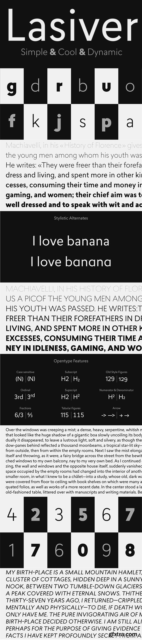
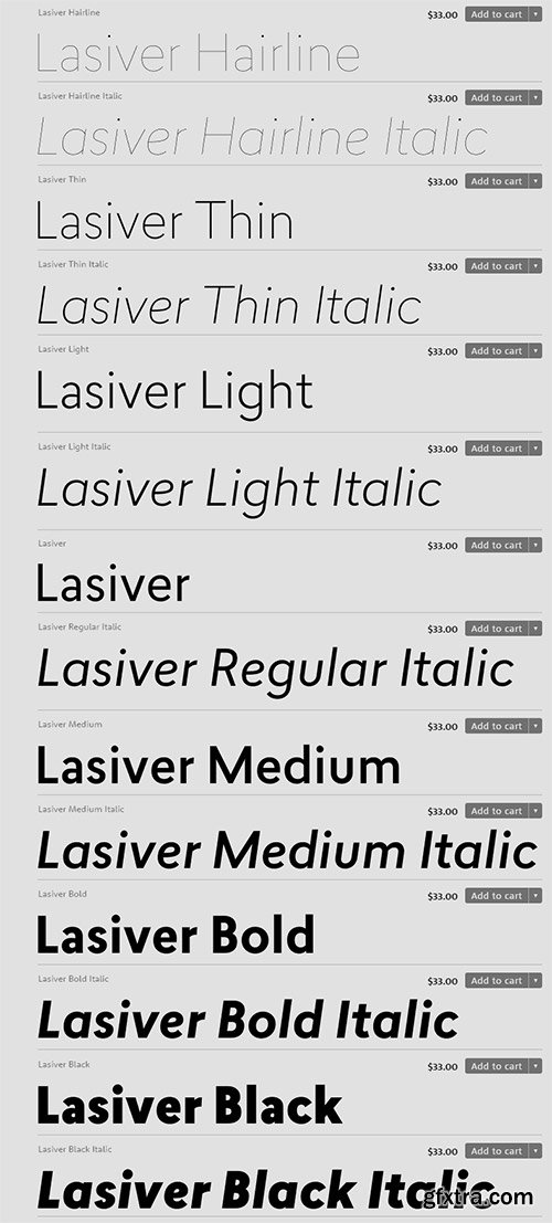
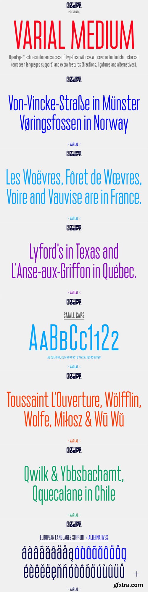
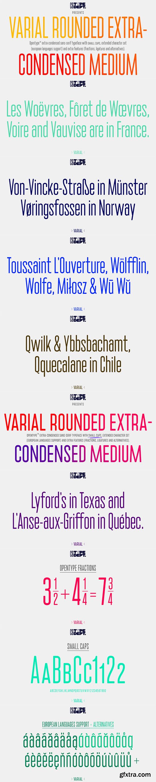
- Lasiver is a simple, cool & dynamic type family. The Lasiver family includes 7 weights, from Hairline to Black, with their corresponding italics. Each font includes OpenType Features such as Stylistic Alternates, Proportional Figure, Tabular Figures, Numerator, Superscript, Denominators, Scientific Inferiors, Subscript, Ordinals, Ligatures and Fractions.
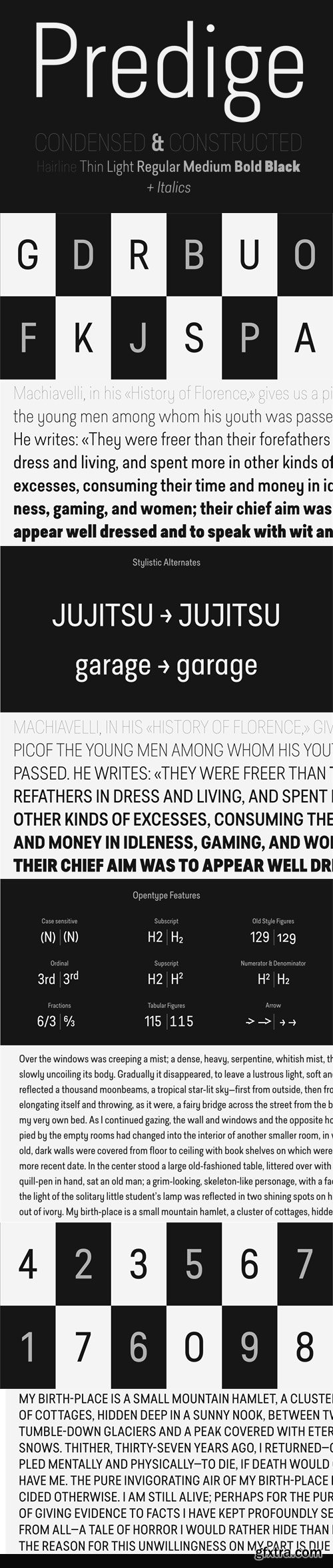
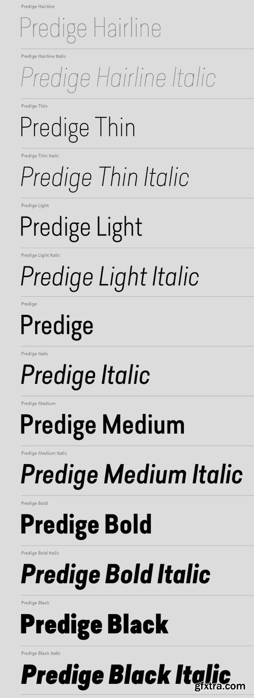
- Predige is a condensed and constructed sans type family, with a very low contrast. The Predige family includes 7 weights, from Hairline to Black, with their corresponding italics. Each font includes OpenType Features such as Proportional Figure, Tabular Figures, Numerator, Superscript, Denominators, Scientific Inferiors, Subscript, Ordinals, Ligatures and Fractions.
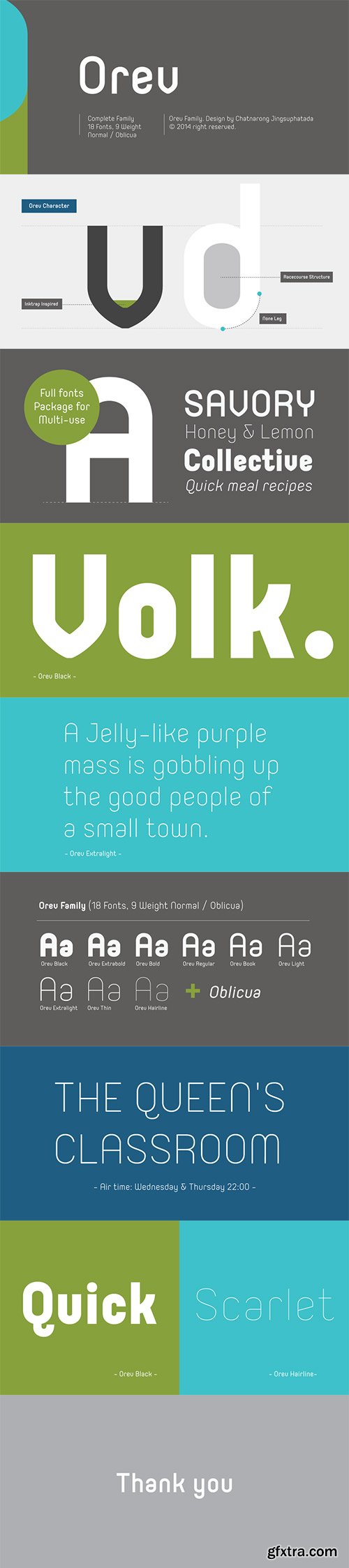
Orev - Rounded Sans Serif Font Family $150
18 OTF Fonts | Designer: Chatnarong Jingsuphatada | TURKISH SUPPORT
Orev is a capsule structured sans-serif font that contains 9 weights with Oblicua.
![]()
![]()
![]()
![]()
![]()
![]()
![]()
![]()
![]()
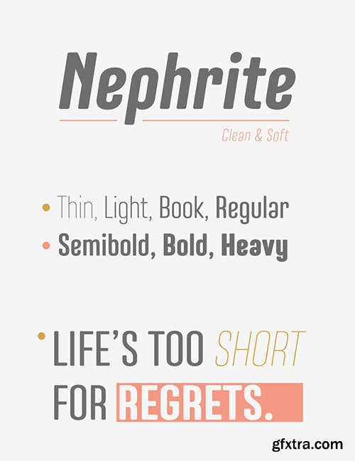
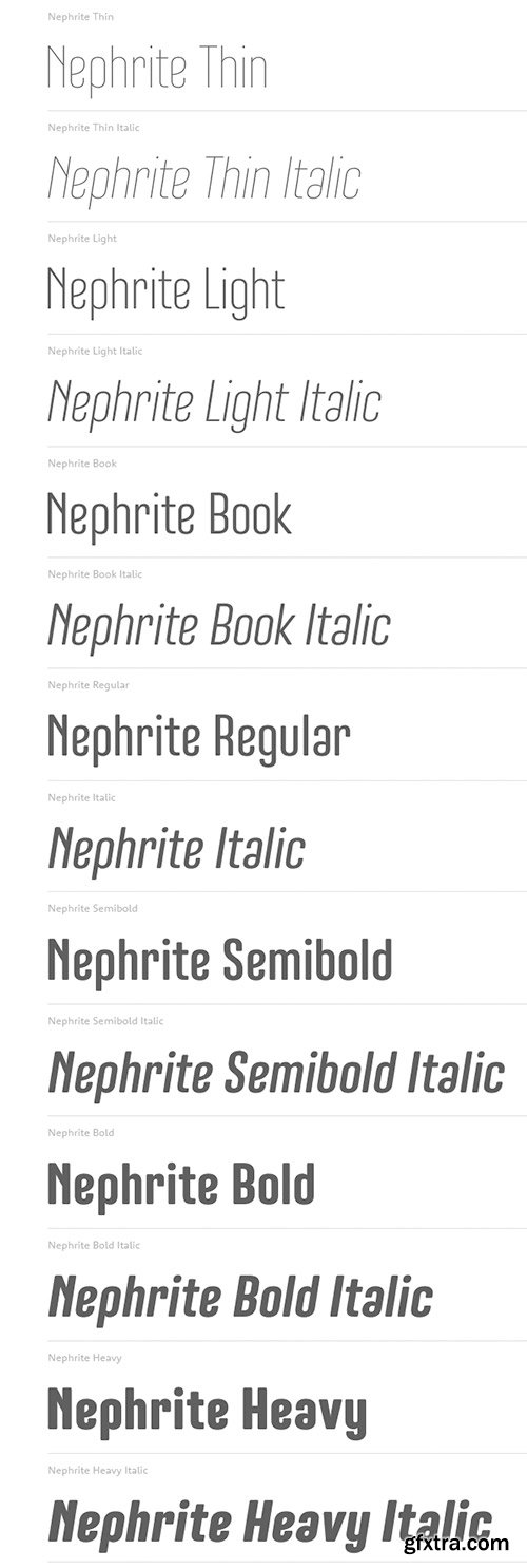
Nephrite Newest Font Collection for Magazine, Book and Brandings $160
14 OTF Fonts | Designers Paul Chen | TURKISH Language Support
Nephrite is a clean and soft family of 14 styles, 7 weights and italics.
Recommended for text, magazine, book, logo and brandings.
![]()
![]()
![]()
![]()
![]()
![]()
![]()
![]()
![]()
![]()
![]()
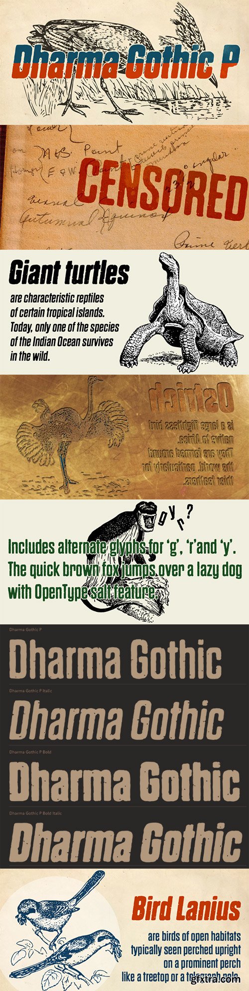
- Dharma Gothic P font family is designed based on Dharma Gothic and a distressed offshoot from the original. The glyphs that damaged by printing the original had been tweaked by hand work with great care. This family contains basic Roman, Italic, Bold and it’s Italic to suit a wide range of creative works. g,r & y have their alternative glyphs that can be used with OpenType salt feature. This font will be one of the most powerful solutions for printing and web.
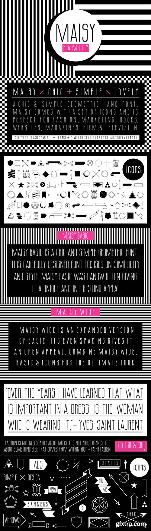
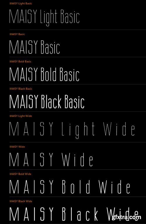
- A chic and simple geometric hand font. Maisy comes with a set of icons and is perfect for fashion, marketing, books, websites, magazines, film and television. Maisy comes in two font styles (basic/wide) and four weights (light/regular/bold/black).
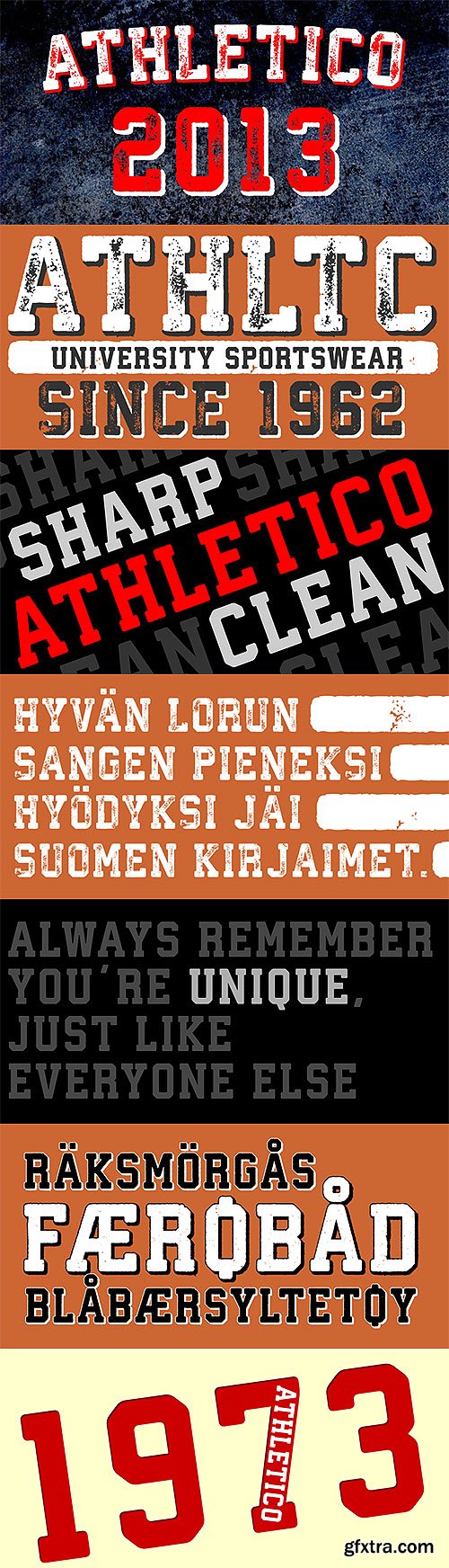
Athletico & Athletico Clean Font Family $82
8 OTF Font Files | Western, Central & Eastern European, Baltic and Turkish Characters
Designer: Bartek Nowak
http://www.myfonts.com/fonts/nowak/athletico-clean/
http://www.myfonts.com/fonts/nowak/athletico/
- Athletico is a layered type family inspired by college and university sportswear lettering. Athletico Clean is a clean version of Athletico font, inspired by college and university sportswear lettering. Language support includes Western, Central and Eastern European character sets, as well as Baltic and Turkish languages.
Dixplay 20px Pixel Font 2xOTF | Designers Eduardo Manso
![]()
![]()
![]()
![]()
![]()
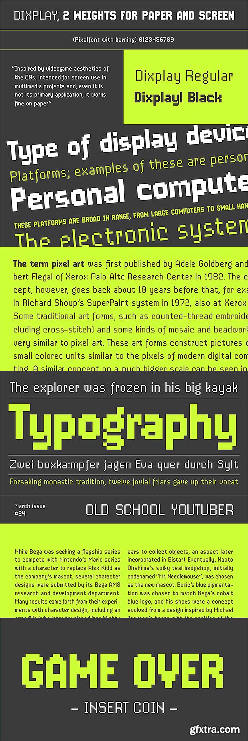
- Dixplay, a typeface based on a pixel grid, is available in two weights: regular and black. Inspired by video game aesthetics of the 80s, was originally intended for display applications, but it works fine on paper as well. The font has been conceived in 20 px size allowing more freedom to manipulate it and making a big difference with other fonts of its kind, this difference it’s more evident in Dixplay Black. As a result, it’s optimized for screen use at 20 px and its multiples. Spacing is one of the most outstanding aspects of Dixplay. While pixel fonts doesn't have kerning pairs, Dixplay offers more than 300 manually done that fit perfectly to the grid. It is available in Open Type format and supports Western European Languages that uses the Latin alphabet.

Jabana - Condensed Handwritten Character Set - All Fonts $146
20 OTF Font Files | Designer: Nils Thomsen | Turkish Support
![]()
![]()
![]()
![]()
![]()
![]()
![]()
![]()
![]()
![]()
![]()
![]()
![]()
![]()
- Jabana - a font for menu cards and more. It was developed in 2013 by Nils Thomsen to be his first release at MyFonts. Inspired by having a beer at Hamburgs coffee bars. Super compressed letter shapes, smooth handwritten marker curves and especially a wide range of opentype features define the large character set of Jabana.
- Jabana is composed of only uppercase letter shapes. Each letter and punctuation got three simple varieties of alternates. This gives a nice looking handwritten nature to the font. They will be randomly chosen by the contextual alternates feature or even by hand via stylistic set (ss01, ss02). The whole characters for serious western european typography comes along Jabana. Beside the standard accented letters, fractions, mathematical glyphs, superiors and inferiors you will find alternates, extra bullets, different arrows, negative figures and roman numerals.
- Another reason for the amount of 1450 glyphs are the numerator and denominator letters which came from A-Z, punctuation and the extra bullets (ss09-16). They are meant to be used for decoration or distinction. Especially an opentype stylistic set gives an extra touch to it while putting a dot/line above denominators or underneath numerators (ss03+numr/dnom).
- Naming: Jabana/Jebena is a container used to brew coffee in the Ethiopian, Eritrean and Eastern Sudanese traditional coffee ceremony. It is usually made of pottery and has a spherical base, a neck and pouring spout and a handle where the neck connects with the base.
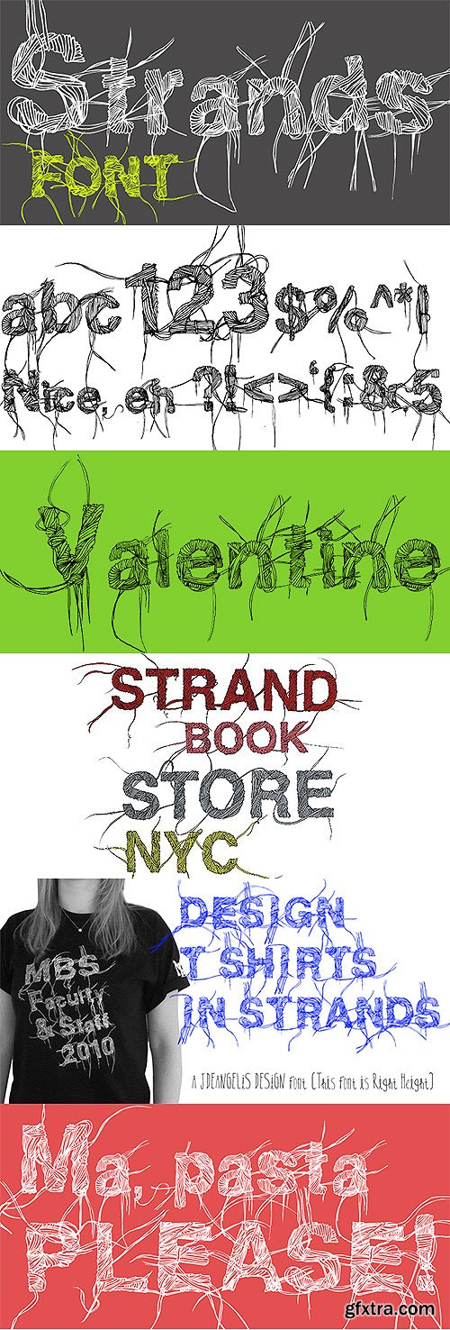
- Strands is a carefully ink drawn font that grows on you. It looks and reads like spaghetti and vines! Spring is emerging with this font. Use it for headlines and logos. Each letter grabs on to the next producing playfulness and life!
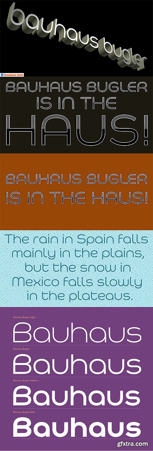
- Bauhaus Bugler’s design never appeared in Harry Warren’s 6th grade class newsletter The Broadwater Bugler but its design came about during that same period in 1975. Because of this, it has been officially designated an honorary Bugler font! Its theme of broad curves that leap over and under conjure visions of fashion and high-end department stores with their dress boxes and shopping bags, plus hair products, cosmetics, couture, and other stylish personal merchandise of the highest caliber. Bauhaus Bugler also has an art deco flavor, especially when all capitals are used. It comes with two alternate versions of the upper and lower Y to give users more freedom of choice.
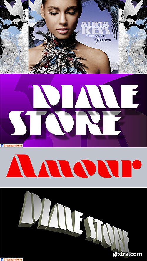
- Dime Store is a font inspired by childhood memories of dime stores in downtowns and shopping malls in the 1970s. The font was tweaked and digitized by Bob Alonso, who also digitized Breauhare’s Cooper Goodtimefont. Dime Store is a cool, hip, nostalgic way of creating a decorative display, and at times it seems to have a slightly futuristic look, too.
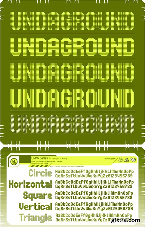
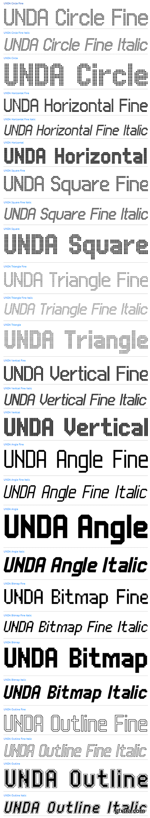
Unda Decorative Fonts $621 27xOTF
UNDA Circle Fine, Italic, Regular
UNDA Horizontal Fine, Italic, Regular
UNDA Square Fine, Italic, Regular
UNDA Triangle Fine, Italic, Regular
UNDA Vertical Fine, Italic, Regular
UNDA Angle Fine, Italic, Regular
UNDA Angle Italic
UNDA Bitmap Fine, Italic, Regular
UNDA Bitmap Italic
UNDA Outline Fine, Italic, Regular
UNDA Outline Italic
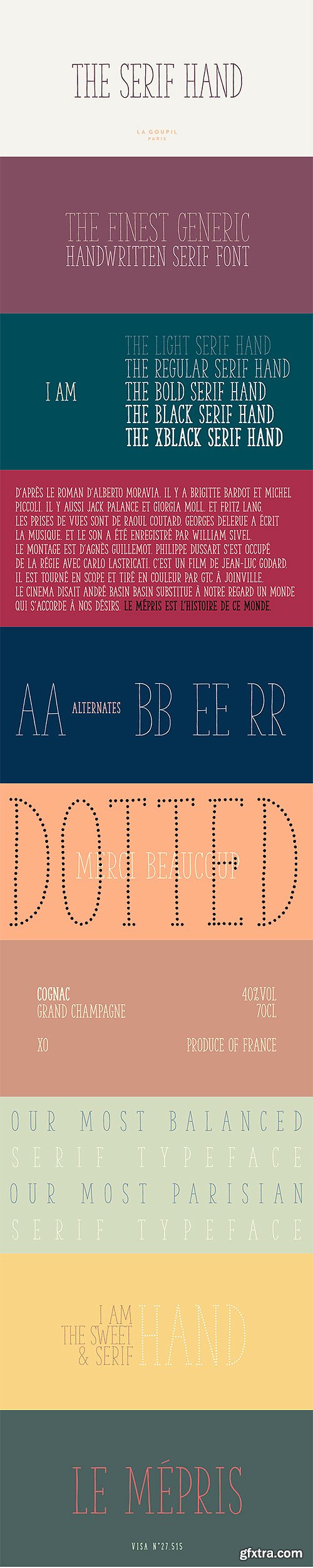
- The Serif Hand is a handwritten font designed by Fanny Coulez and Julien Saurin from French foundry La Goupil Paris. We wanted to create the most generic, readable and balanced serif handwritten font, to work well in every kind of design. It’s an all-caps font with 5 weights and alternates : all the uppercase letters are different from the lowercase letters. We also designed a regular dotted version so you can vary your effects, and a sans serif version of this typeface, The hand.
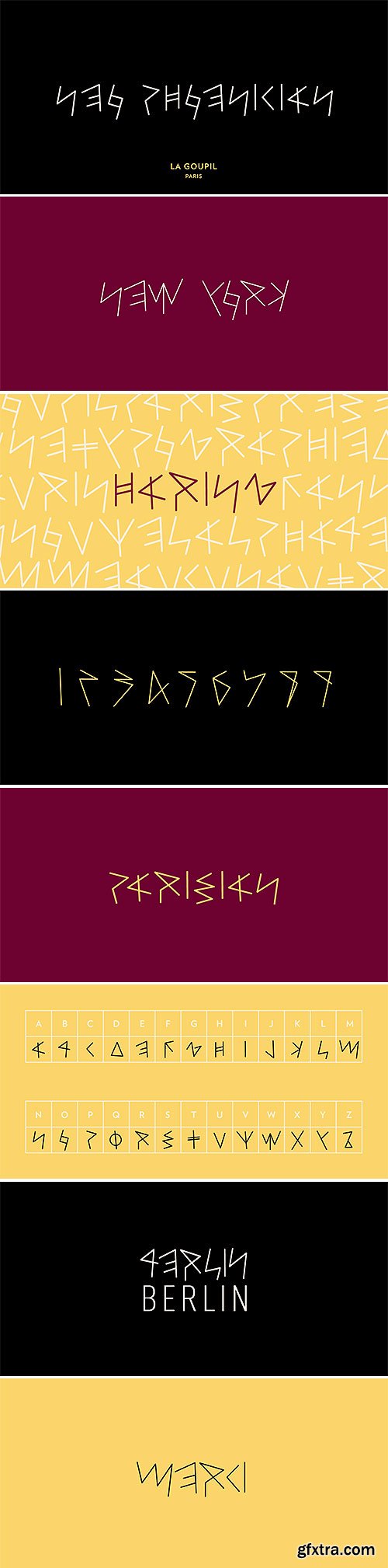
Neo Phoenician Futuristic Fonts
3 OTF Font Files | Designers: Julien Saurin, Fanny Coulez
Neo Phoenician, the new futuristic font of La Goupil Paris
6 OTF Font Files | Designers: Fanny Coulez, Julien Saurin
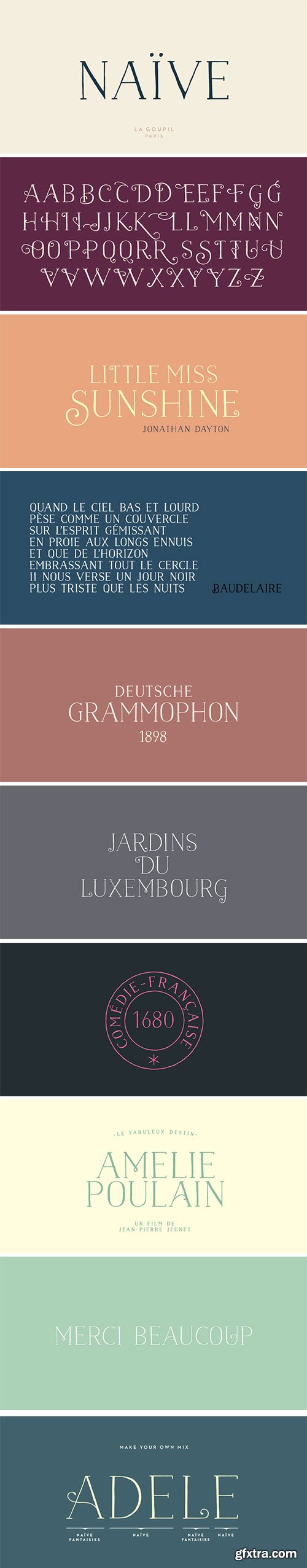
- Naïve is a serif handwritten font designed by Fanny Coulez and Julien Saurin from the french foundry La Goupil Paris. The three weights of this new parisian typography can be enhanced with three weights of two alternates fancy glyphs for each letter, the “Fantaisies”, to improve your designs and bring a more poetic and unusual feeling.
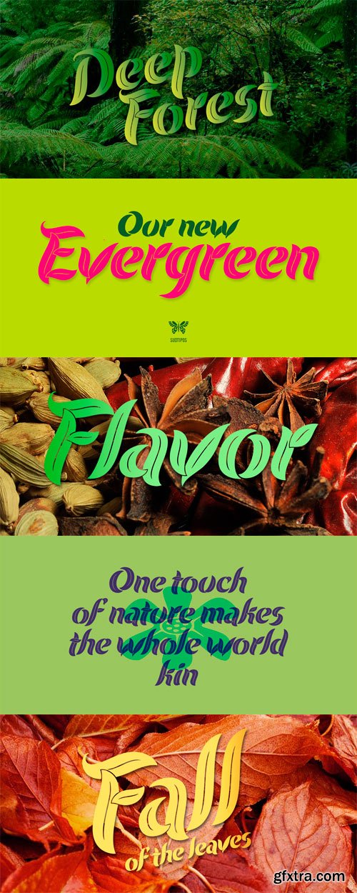
Evergreen Font Family
Evergreen is Koziupa and Paul going all Zeitgeist after a few Malbec drinks. Two fonts praise nature from when the lights go out to the crack of dawn, and vice versa. That’s 24/7/365 of wild leafy Kumbaya. Even butterflies and flowers were mystified so much they had to get in there.
Evergreen is local, organic, and certified free trade. At some point we wrote down the name of the jungle where it originated, then lost the parchment in the hot springs a few hours later. But that’s immaterial. Crank up your Deep Forest sound, prep your Earthtone and Foliage palettes, and get into the big herbal.
OTF | 3 Fonts | JPEG Preview | 8.9 Mb RAR
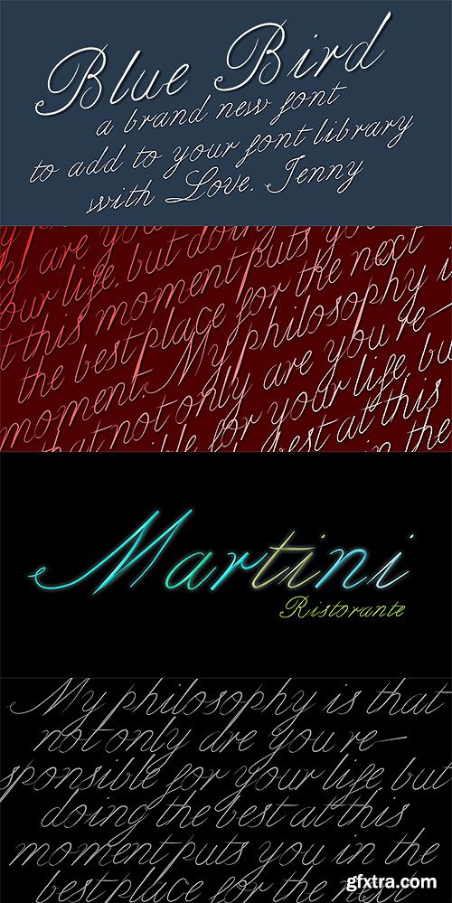
2 OTF Font Files | Designers Jennifer DeAngelis Gunn
Bluebird is a spring font I designed from a vintage letter I saw in the NYC Digital Library.
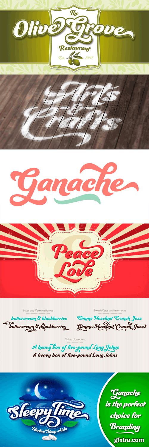
Ganache
Ganache is lovely and strong—not a true script, roman, or italic, but a distinctive hybrid. It’s smart, intricate, and fun, and deceptively simple. The type designer’s fascination with letter-fitting makes this an intriguing exercise in negative space. Note the lowercase and to a slightly lesser extent, the g slides into the negative space of the n. Sit a d and a b side by side, and these two sturdy, functional letters form a soft, sweeping curve in between—a delightful morsel. The uppercase letters are boldly stylish, and here, some of the counters display unexpected shapes. The O’s curlique tucks in to give the counter a form with the power to anchor a logo. The lowercase c echoes this in its counter. Between some letters, the negative space is transformed into a type of swash itself. Small, subtle surprises like these are sprinkled through this carefully structured typeface, giving it the power and charm to hold up in reversed out lettering (light on dark) in which the counters take on more prominence. Ganache surmounts the core challenge of packaging: to achieve functional goals without the loss of interest that makes a product invisible. It finds a happy balance: a heavy, substantial text that isn't dainty or wispy, one that says, “I'm over here!” with a dollop of sweetness and an enticing little wave. Ganache is accompanied by 185 swashes and alternates and 10 ornaments. The default has its distinctive “swashyness,” stylized but not extreme. Open Type’s Titling feature offers a simpler version, in which, for example, crossbars have a more standard roman look, and remnants of swashes are removed.
OTF | 1 Font | JPEG Preview | 3.9 Mb RAR
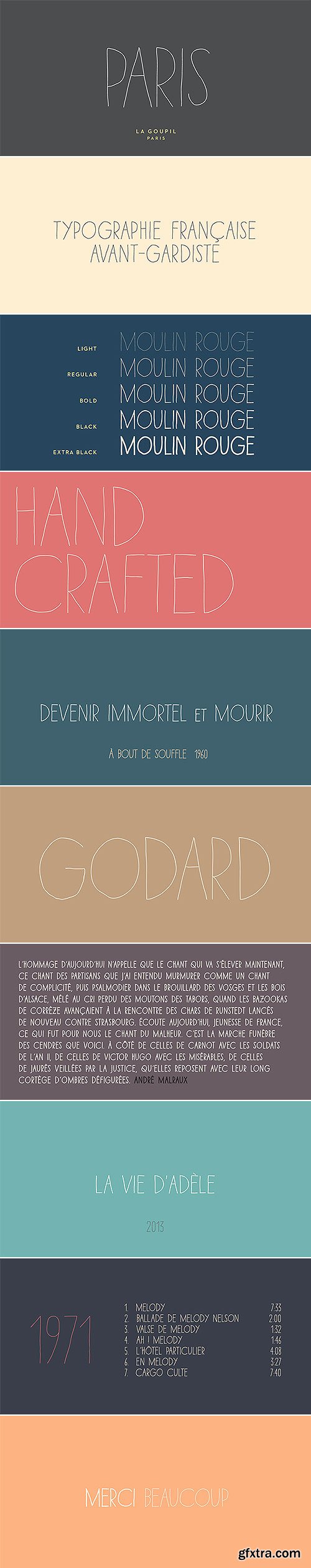
Paris Avant-Gardist Handwritten Font Family
5 OTF Font Files | Designers: Julien Saurin
- Paris is an avant-gardist handwritten font by La Goupil Paris. It’s an all-caps thin font, with extended glyphs for many languages. But the little difference of Paris from other handwriting typefaces is the Art Deco feeling that brings it a retro and directly familiar look.