Dream Script Pro Font Family
Dream Script may be that dream named above made true. I have been practicing chancery in the way I learnt from those calligraphers for many years now.
Making a font out of my ink-sketches was a tough work, since they were closer of -being art- than of -being type-. However, this font rescues many aspects of handmade calligraphy: You have to look at it really close to notice it is actually a font, and that was one of my goals. The secret of a good looking chancery is on its subtle details: pen angle is constantly changing, even on the strokes which seem straight. Capitals and swashes have to be done a little faster than lowercase letters. The rhythm has to be even, in spite of its playful look. The fact that makes Dream look alive is that it has many alternates per glyph. This makes each word look unique like it happens in calligraphy: you will find alternates for the beginning/ending of a word/phrase, some for the middle of it, some interchangeable. Also, to accompany the script, you will find Dream Caps, which was inspired in the eternally beautiful trajan capitals. Place them like I did on the posters and you will have great results for sure. The font works great in small, middle and big sizes and can be a great selection for magazines, wedding invitations, perfumes, and posters. Dream Script Pro is the most complete style, it contains all the alternates and ligatures (OT programmed, better if you use Adobe applications). If you plan to use the font for text, be sure to activate the less decorative capitals, which are placed in the “salt” group of alternates. Dream Script Standard has less glyphs than the Pro one, it contains just some ligatures for a better legibility. (OT programmed, better if you use Adobe applications).
OTF | 2 Fonts | JPEG Preview | 5.4 Mb RAR
Bree Serif Font Family
In 2008 TypeTogether released the Bree typeface, a sleek sans serif that quickly became a favorite among brand and editorial designers. Bree Serif follows the same theme as its predecessor. It is a young and energetic upright italic that approaches readers with hip and somewhat elegant charm. It has a range of styles that can perform as counterparts to the original Bree fonts. At the same time though they bring a whole range of new and individual features that make Bree Serif a separate type family in its own right. The characters in Bree Serif maintain the original flavour of handwriting, but have a more subtle appearance to support optimal editorial usage. The slabby nature of its shapes, particularly in the heavier weights, makes for a strong impression. Some of the characteristic features of its sans serif cousin are present in Bree Serif too, such as the single-story ‘a’, the cursive ‘e’ and the rhythmical ‘k’ and ‘y’. Alternate letters of these are also available when a more neutral look is desired. Bree Serif offers a mixture of fluid and attractive forms that convey a contemporary and vivid aspect.
OTF | 12 Fonts | JPEG Preview | 4.8 Mb RAR
Signor Font Family
Signor is a soft and easygoing all caps font. Signor is very easy to use and is at its best when you need to make an impact but have a casual feeling.
TTF | 5 Fonts | JPEG Preview | 4.3 Mb RAR
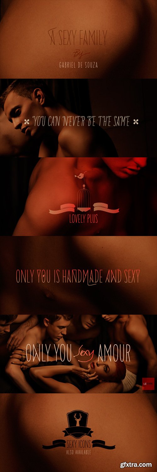
Only You Sexy Font Family
Is the real romanticism over? This is not the intention achieved on a creation of the new version of Only You Pro. Develop a font that reflects the perfect union of sensuality and romanticism: Only You Sexy. It has a soft trait and delicated curves that evokes contemporary and musicality while has erotic and sensual references. The icons are a piece of show. They make reference to hipsters concept a recurring nostalgia and a recovery of an almost forgotten romanticism. Bring all that romance back. Bring the sensuality in your work and graphic texts. This font brings back everything that the true romanticism deserves: a font that allows you to write using beauty, sensuality and the sounds from the hearts. Only You Sexy is handmade, stylish, modern and multilingual. With more than 800 glyphs it is possible to get an infinity of combinations at your disposal. The font doesn't have PDF and works better in softwares that support the complete OpenType function.
OTF | 10 Fonts | JPEG Preview | 13.6 Mb RAR
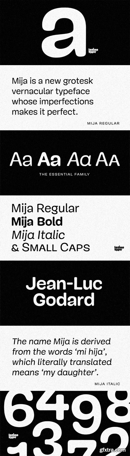
Mija Font Family
Mija is a grotesk vernacular handmade typeface whose imperfections make it perfect. It is a fresh hand-painted display face with a warm and organic feel. This full-of-ink-traps typeface is inspired by local vernacular signs. Mija looks good at both large and small sizes. The family is available in a 4-font combo package, suited for solving most common text hierarchy problems in graphic design; Roman, Bold, Italic and Small Caps. Mija is derived from the words ‘mi hija’, which literally translated means ‘my daughter’. Mija is a Latin American Spanish term of endearment most of the time used by an older person to a younger girl or woman.
OTF | 4 Fonts | JPEG Preview | 5.3 Mb RAR
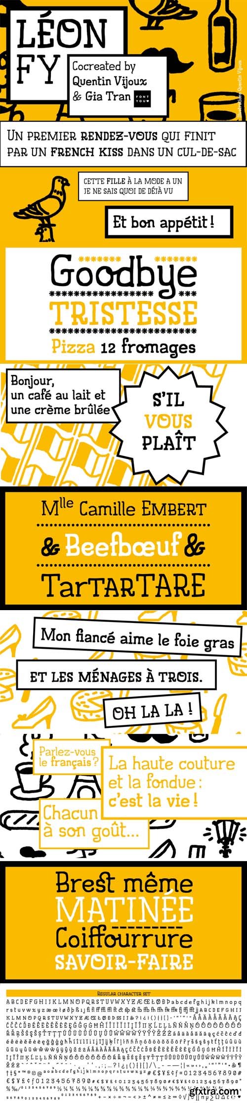
Leon FY - 2 Fonts for $105
TTF, OTF | 2 FONTS | 2 MB
Léon FY is a handwritten font co-created by a french illustrator and cartoonist. With its spontaneous and friendly design, this typeface will give fun and freshness to your creations. It can also give voices to your drawings! Available in two weights – Regular and Medium – Léon FY includes smallcaps, ligatures and some alternates.
Léon FY font was co-created by Quentin Vijoux & Gia Tran on fontyou.com, the first collaborative type foundry.
Cheap Pine Font Family
Cheap Pine is a tribute to the wood type of the eighteenth century and nineteenth century. You can use Cheap Pine Sans & Cheap Pine Shadow together to influence the color of the shadows. The font contains arrows, hands, stars and other special glyphs available through the OpenType ligatures feature.
OTF | 3 Fonts | JPEG Preview | 3.7 Mb RAR
Camphor Pro Font Family
Inspired by Edward Johnston's type for the London Underground and Eric Gill's Gill Sans®, Camphor™ is also informed by the European sans serifs typified by Adrian Frutiger. However, Camphor copies neither. It is narrower than Johnston's type and eschews the idiosyncrasies of Gill Sans, making for clean and cool, modern sans serif that lends itself to everything from branding and wayfinding to advertising and editorial design. Nick Job says I wanted to draw a modern, uncluttered sans serif family with classical proportions, unashamedly English but with fewer idiosyncrasies than its influential forerunners. And he succeeds. Despite it lack of embellishments, Camphor resists the sterility of other faces designed on the same premise. It is a lean, self assured, legible, and versatile type, coming in six weights, from thin to heavy, all with companion italics, small caps, alternates, and broad language support.
OTF | 12 Fonts | JPEG Preview | 4.7 Mb RAR
Aldo Font Family, 5 Fonts $89
5 OTF and WOFF WebFonts | 17 MB | Designer: Jonathan Hill 2009
http://www.myfonts.com/fonts/northernblock/aldo/
- Aldo is a 5 font family. A bold stylized type face re-worked from the original 1970s movie poster The Battle For The Planet Of The Apes.
Ainslie Font Family $1008 | Designer: Jeremy Dooley 2013
42 OTF and WOFF Files | 72 Languages | 59 MB
http://www.myfonts.com/fonts/insigne/ainslie/
- Get your Aussie on! The new typeface, Ainslie, with its mix of influences from Oz, makes its mark as the first semi-serif from insigne Design.
- Ainslie, named for Mt. Ainslie and Canberra’s inner suburb of the same name, was originally developed for the Canberra Australia Centennial Typeface Competition. Canberra is Australia’s capital, and it’s a planned city designed by American Walter Burley Griffin, a contemporary and one-time associate of Frank Lloyd Wright. Griffin’s plan involved a distinctly geometric design with several focal points--one of which was Mt. Ainslie. This same purely geometric scheme is now the basis for insigne’s new release.
- Similar to the Chatype project in its scope, its challenge, and the way its concept was developed, Ainslie incorporates influences from Canberra and surrounding areas to form a font that is uniquely Australian. In comparison, Chatype was developed for the city of Chattanooga, Tennessee by insigne in conjunction with designer Robbie de Villiers. Chatype took elements from Chattanooga’s industrial character and Cherokee past and merged them with the area’s technological influences.
- Likewise, Ainslie takes Canberra’s distinct, geometric design and blends it with the organic, flowing effect of aboriginal art. Add in touches from the smooth, aerodynamic design of the boomerang and Ainslie gives you a look uniquely Australian yet usable in a wide range of applications.
- The fashionable typeface includes a multitude of alternates that can be accessed in any OpenType-enabled application. These stylish alternates along with a number of swashes as well as meticulously refined details with ball terminals and alternate titling caps keep the font well accessorized. Also included are capital swash alternates, old style figures, and small caps. Peruse the PDF brochure to see these features in action. OpenType enabled applications such as the Adobe suite or Quark can take full advantage of the automatic replacing ligatures and alternates. This family also offers the glyphs to support a wide range of languages.
- While Ainslie wasn't selected as the final font in the Canberra competition, the outcome allowed for additional adjustments to the typeface. Several approaches were attempted for the final product including a technological hexagonal concept, which may still be developed to another form later. Some of the organic forms were removed and substituted with more abrupt endings, leaving the face looking pretty spiffy and a fair bit more legible. In the end, Ainslie was pulled back to the basic forms from which it was started.
- Give it a go for your next project. It’s guaranteed to be anything but a barbeque stopper.
Arcano Decorative Hand-Drawn Font $39
OTF & WOFF WebFont | 4 MB
http://www.myfonts.com/fonts/resistenza/arcano/
- After four long months of work, Arcano Type has finally been released. It was completely designed by hand, letter by letter, using Chinese ink on Japanese calligraphy paper. Arcano is inspired by nature, symbols, icons, jewels, hand-drawn designs and much more...
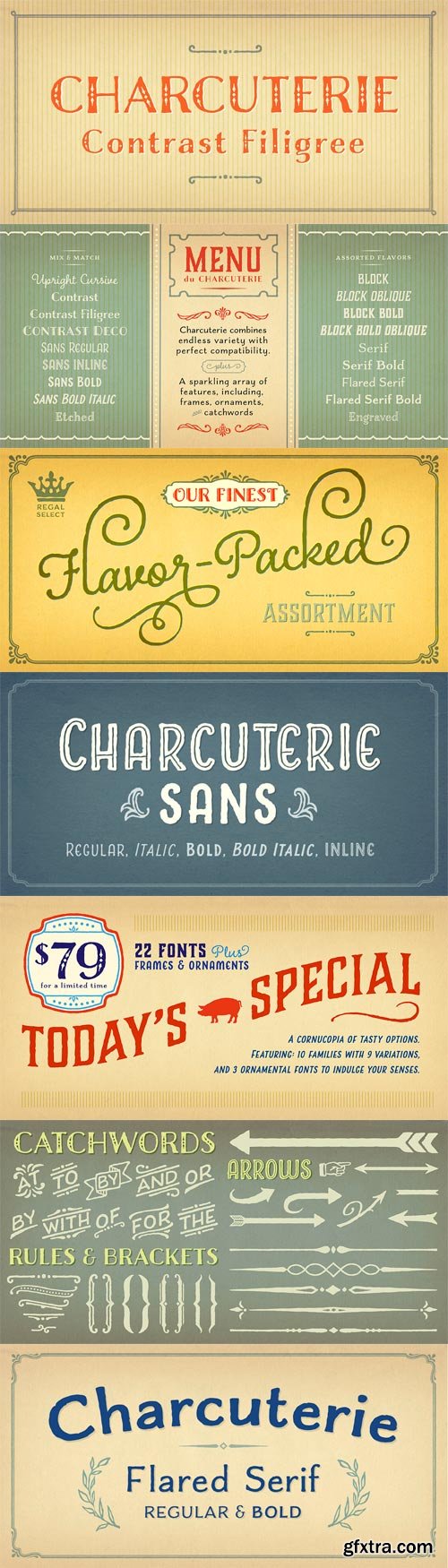
Charcuterie Font Family
A large and rare undertaking, Charcuterie is a family of ten distinct yet related typefaces, many of which have their own font families, and three decorative/ornamental typefaces. While most of the Charcuterie typefaces are outfitted with a standard character set, Charcuterie Engraved features 135 swash alternates and Charcuterie Cursive boasts 275. Charcuterie Frames offers a broad and endless approach to creating frames of any width, height and style. Featuring 60 corner elements and 20 top, bottom and side pieces along with a detailed User’s Guide in the ‘Gallery’ on how to construct the frames. Charcuterie Catchwords features nine different styles for a total of 82 glyphs. Charcuterie Ornaments is very practical and features 100 glyphs a vast array of arrows, brackets, rules, icons, ribbons and more. This ambitious, yet accessible, set offers a virtually endless series of combinations, allowing each designer to form a tasty platter of ingredients, one that is uniquely theirs, for each project. Used solo or blended with other fonts from this large family, elements of Charcuterie are well suited for headlines, titling, logos, display, packaging, signage, or advertising. Dig deep into each typeface to find a rich set of fonts (the number depending on the typeface), revealing variations upon variations. The word charcuterie means the preparation of meats. Today, it often refers to a wide and varied selection of meats served together, listed as a single, beautiful, and complex menu item. Charcuterie celebrates the personally crafted -- the sense of the human touch giving it a slightly rough edge that only adds to its charm. The ‘roughness’ derives from a slight stressing and small irregularities in some fonts. This bit of unevenness doesn't dominate the look -- it’s simply the personality and humanity of the type designer cooked into the final piece. Charcuterie is an homage to the inventiveness, passion, and care of peasants who proudly handed down recipes through generations. Their humble fare is used by bistro chefs to create masterpieces by ever so slightly transforming the simple into the sumptuous. Similarly, with Charcuterie the designer can employ the handcrafted look of the many letters within these font families to create a project that is jaunty, quirky, and juicy or one that is a gloriously rich and varied feast for the eyes.
OTF | 22 Fonts | JPEG Preview | 29.3 Mb RAR
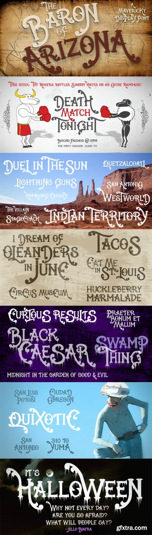
Baron Of Arizona Font Family
The Baron of Arizona is a hand-drawn, baroque cowboy font who comes with a Halloweeny sidekick. The Baron is the next generation version of a popular font I designed in 1999 called Cowboy Rhumbahut. This is the full small cap font with support for Western and Eastern European keyboards.
TTF | 2 Fonts | JPEG Preview | 4.2 Mb RAR
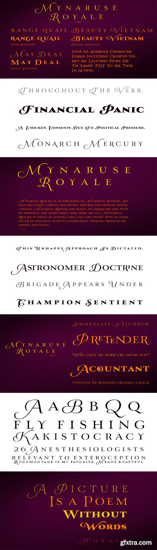
Mynaruse Royale Font Family
Mynaruse Royale is an expansion of Mynaruse Titling. It features script capitals and widely tracked and smaller titling capitals. Mynaruse Royale has plenty of character and, with its powerful and sharp serifs it draws in the eye. Mynaruse Royale is useful in settings that call for titling with an extra touch of elegance, such as a storefront, wedding program or formal invitation. Mynaruse Royale contains a number of OpenType alternates, including alternate forms for the capitals that are large, drop cap like capitals instead of the calligraphic script capitals found in the default forms. Additionally, there are non-widely tracked lowercase forms that work well with the included alternate characters and ligatures. The lowercase forms are 80% smaller in height than the Mynaruse lowercase forms, so the families are not interchangeable, but they can be used together. The calligraphic script capitals could also be used separately as drop capitals. OpenType-capable applications such as the Adobe suite or Quark can take full advantage of automatically replacing ligatures and alternates. This family also includes the glyphs to support a wide range of latin based languages.
OTF | 6 Fonts | JPEG Preview | 4.7 Mb RAR
Rotokas
Rotokas is a sans serif typography. It is probably the first font designed exclusively to type Rotokas language. Spoken by Bougainville islanders (Papua New Guinea), Rotokas has the world’s smallest alphabet consisting of only twelve latin letters. This typeface has a great performance either on continuous text or at display sizes. Its rounded corners and insinuated ovoidal forms, inspired by papuan artworks, give this typography a warm and friendly feel.
OTF | 1 Font | JPEG Preview | 13.1 Mb RAR
Founders Grotesk Font Family
OTF | 13 Fonts | JPEG Preview | 4.1 Mb RAR
Andes Italic Font Family
Andes, designed by Daniel Hernández, is a display typeface that has neo-humanist characteristics. Its different terminals, among other elements, give it a look of mixed typography. Andes is a typeface with 10 Upright weights, 10 Italics & Condensed version, ranging from Ultra Light to Black, each of the same x-height. This typeface contains additional italic glyphs (a, y, z, g) that help to emphasise text or words. Andes is based on the design of Merced and both of them share several features. This type is well-suited for use in retail, magazines, logotypes, books, etc.
OTF | 10 Fonts | JPEG Preview | 1 Mb RAR
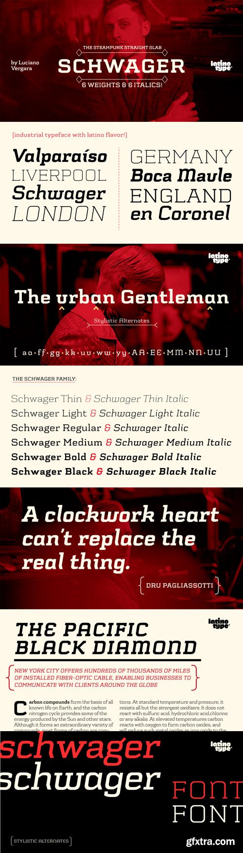
Schwager Font Family
Schwager is a steampunk slab serif typeface with an industrial accent in a contemporary tone. Its strong structure and male, makes it ideal for titles, headlines and brands of male lifestyle, technology and trend. This typeface contains alternate glyphs that help to emphasize text or headlines.
OTF | 12 Fonts | JPEG Preview | 4.6 Mb RAR
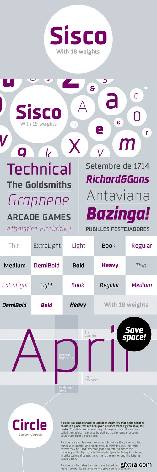
Sisco Font Family
Sisco is a complete font family of 18 weights intended for editorial use and brand identity. Open counterforms give it a touch of modernity and technological. Sisco is designed to be legible in small sizes in both paper and display devices. It contains a set of authentic Small Caps and various sets of numerals, fractions, ligatures, and an extensive map of suitable characters for most languages based on Latin characters. Sisco is a typeface that will bring the future to your graphic projects.
OTF | 18 Fonts | JPEG Preview | 4.9 Mb RAR
Ashemore Softened Font Family
Following the success of the Ashemore family, is became clear that a rounded version of Ashemore would be a great addition to the product line that would allow designers even more design choices. Ashemore Softened’s rounder forms compliment the face well as the original font eschewed straight lines. The rounded terminators give the face a sense of friendliness that is unsurpassed. The distinct and flamboyant style of Art Nouveau and the Arts and Crafts style remain, but the blunted terminators give the face a more technological and contemporary look and feel. The Ashemore Softened family has a full range of six weights from thin to black and includes condensed and extended options for a total of 36 fonts. The typeface also includes some unique OpenType alternates that make the superfamily even more versatile. Ashemore Softened is equipped for complex professional typography, including alternates, small caps and many alternate characters. The face also has a number of numeral sets, including tabular figures, fractions, old-style, lining figures and superiors and inferiors. OpenType-capable applications such as Quark or the Adobe Suite can take full advantage of automatic ligatures and alternates. You can find these features demonstrated in the .pdf brochure. Ashemore Softened also includes the glyphs to support a wide range of languages, including Central, Eastern and Western European languages. In all, Ashemore Softened supports over 40 languages that use the extended Latin script, making the new addition a great choice for multi-lingual publications and packaging. The original Ashemore was designed by Jeremy Dooley with production assistance from Lucas Azevedo and Marcelo Magalhaes.
OTF | 36 Fonts | JPEG Preview | 9.3 Mb RAR
CA Spy Royal Font Family $39
6 OTF and WOFF Font Files | RAR 27 MB | Designer: Thomas Schostok
http://www.myfonts.com/fonts/capearcona/ca-spyroyal/
- Spy Royal is a junctionless script typeface and comes in 6 styles. It’s a hybrid between script and so called streamline fonts. The origins are based on an advertising by Japan Airlines, dated around 1954, offering flights to San Francisco, Honolulu and Okinawa in the new DC-6B “Pacific Courier” airplane. Only the letters for the words “JAPAN AIR LINES” were used, so that the creative part was to reimagine a full font out of just a handful of uppercase letters.
- Originally released in 2004, Spy Royal was now undergoing a major rework and is now republished with additional styles like shadow-lines and 3D-shadow. Its charm is manifold, we think everything related to cars, racing, hot rod, vintage, cocktails, retro, restaurants, gasoline and of course airlines will look great in Spy Royal.
- Spy Royal includes alternate characters, ligatures and West European diacritics.
AIKO Font Family $38
2 OTF and 2 WOFF Webfont Files | 15 MB
http://www.myfonts.com/fonts/thinkdust/aiko/
Aaux Next Compressed Font Family $280