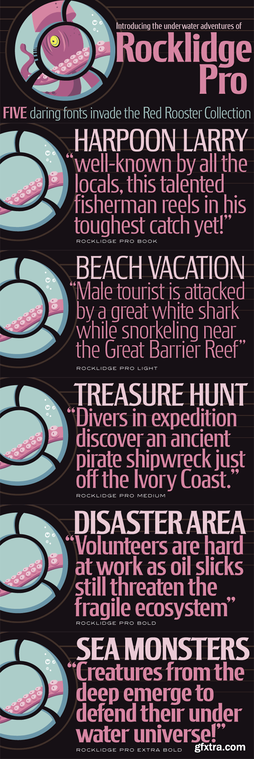
Rocklidge Pro Font Family
Steve Jackaman & Ashley Muir. This design was inspired by the 1965 VGC typeface, Jana by Richard D. Juenger. Rocklidge contains all the high-end features expected in a quality OpenType Pro font.
OTF | 5 Fonts | JPEG Preview | 4.9 Mb RAR
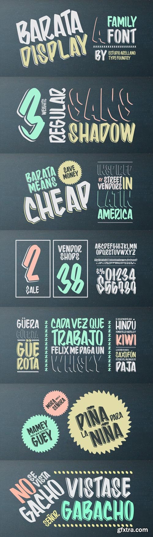
Barata Display Font Family
Barata Display is an all caps script family font inspired by the street vendors and informal commerce in Latin countries. A condensed defined and thick stroke evokes the chalk signs that are made in “tianguis”, markets, greengrocers, barbecues and flea markets from Los Angeles to Buenos Aires. It is a typeface that “SCREAM” buy me, save money, discounted, almost Free, opportunity! What distinguishes the New Barata Display from Estudio Arellano Type Foundry is the expressive power of its structure. The Alphabet is built on the geometric principle of free traces from freehand writing. Composed of 236 capital Roman characters, Barata Display includes most common accents and diacritics. Barata Display can be used in any kind of commercial or personal promotion, in graphic design, web, print, animation, etc. Perfect for price labels, tags and other applications such as posters and t-shirts. It is a typeface ideal for headlines and Lettering.
OTF | 3 Fonts | JPEG Preview | 9.5 Mb RAR
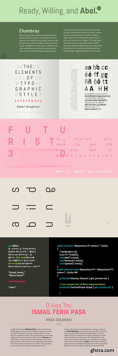
Abel Pro Font Family
Abel is a modern interpretation of the condensed flat-sided sans serif. Originally used for newspaper headlines and posters, this style can also be used for text on the web. Its angled terminals and spiked stems give it enough style to be unique at display sizes, while its mono-weight still works well at smaller text sizes.
OTF | 2 Fonts | JPEG Preview | 4.6 Mb RAR
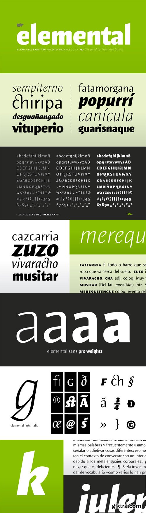
Elemental Sans Pro Font Family
Elemental is a font created in 1997 and launched in 2001. It is a Sans Serif of humanist type and its principal characteristic is a hybrid between different form of calligraphic outlines. In 2010 it was redesigned for Chile’s bicentenary in Opentype version and an improved italic. It is offered in eight weights: Light, Regular, Bold and Extrabold and small capitals for each one of them.
OTF | 8 Fonts | JPEG Preview | 4.1 Mb RAR
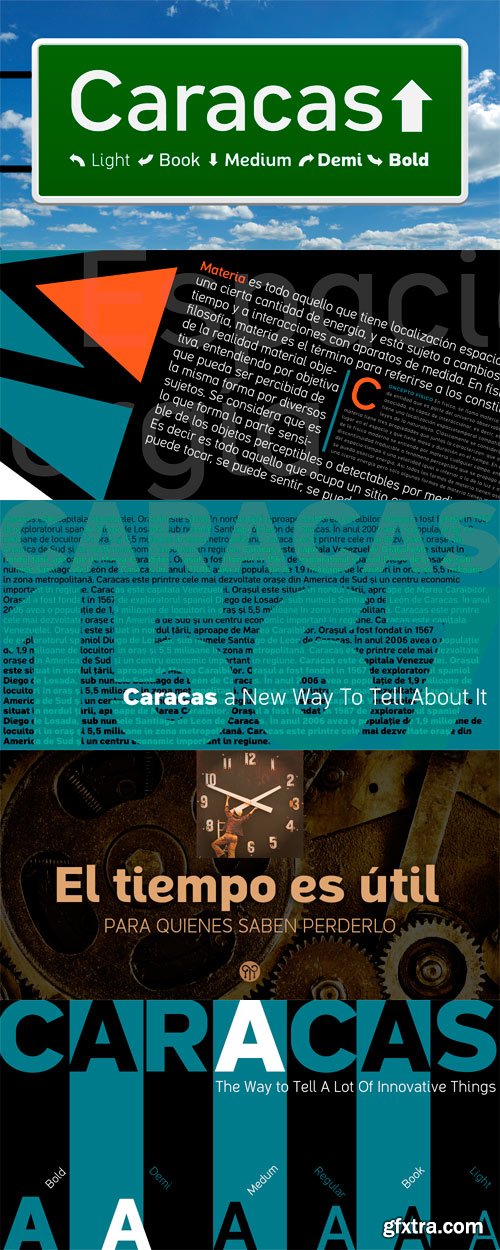
Caracas Font Family
Caracas is a family of sans serif fonts, looking friendly, sweet and comfortable to read. Where text flow between straight lines and round by becoming transparent in the interest of readability. Caracas is ideal for working in small letters and texts of a technical nature. Caracas is a humanistic approach to reading sans forms.
OTF | 6 Fonts | JPEG Preview | 6.6 Mb RAR
Design System Font Family
Design System is a great type system consisted of 5X7X2=70 font styles from 70s-style simple square sans to the widest style of all time that are best for titles, logo and text. Their simple form does not limit the target of design and can be used for any creative work. Additionally they all have been designed not to provide a feeling of strangeness when they are used in mixture each others.
OTF | 70 Fonts | JPEG Preview | 4.4 Mb RAR
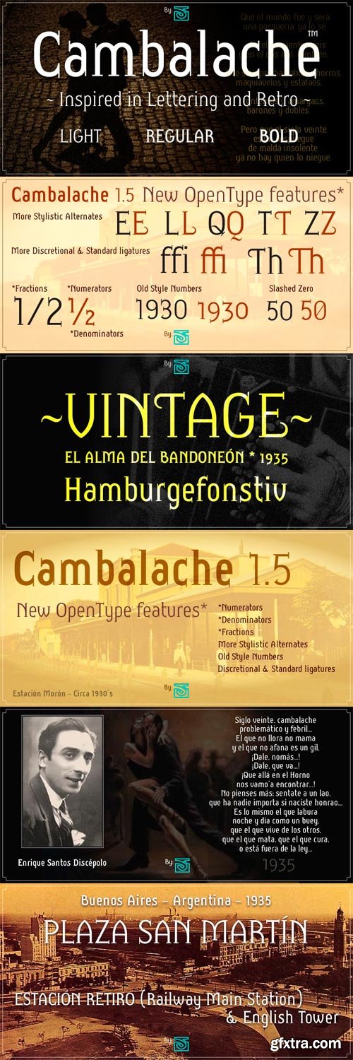
Cambalache Font Family
The idea for Cambalache was conceived back in 2008 and was to create a geometrical font based on tangential modules into structure. The serif would be arranged, looking to approach to the lettering shapes. The creative concept has a feel from the mid-30s of last century, reaching a taste of retro and vintage style. Includes oldstyle numbers, slashed zero, standard and discretional ligatures.
OTF | 3 Fonts | JPEG Preview | 7.5 Mb RAR
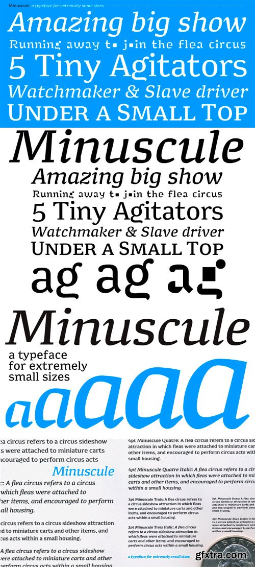
Minuscule Font Family
Minuscule was inspired by Émile Javal’s research into the physiology of reading. He was a 19th-century opthalmologist, the first to analyze how we read. Minuscule characteristics are large x-height, robust slab serifs, vertical stress, open structure, big counters, low contrast.
Minuscule is a typeface for extremely small sizes, and can be used under the commonly acknowledged threshold of legibility (around 7 points). At this stage, the loss is so important during the shift to a lower size that I quickly decided to design a master for each size. Five versions have been developed, optimized for a use in 6 (Minuscule Six), 5 (Minuscule Cinq), 4 (Minuscule Quatre), 3 (Minuscule Trois) and 2 pts (Minuscule Deux).
Minuscule received the Certificate of Excellence in Type Design from the Type Directors Club New York, in the TDC2 2005 Type Design Competition (category Text).
OTF | 10 Fonts | JPEG Preview | 6.2 Mb RAR
Quarca Font Family $250
http://www.myfonts.com/fonts/insigne/quarca/
- Quarca’s masculine power runs strong across the page with bold self-assurance and a raw energy that courses through its thick veins.
- Don't think the continuous, smooth geometry of this semi-modular face is captively chained to the grid, though. Quarca has been cautiously optimized to engage the reader’s eye. Achieving an attractive balance to its sturdy design, the open forms of this “rounded square” geometric sans -together with a tall x-height- make the font legible even when using the compact widths. This high-impact typeface definitely doesn't sacrifice versatility for style.
- These compact widths, with their raw heart and strength, are perfect for callouts, while the extended widths provide you with the platform for a punchy and extremely efficient headline. The font has a thinner weight and transcends to an intense bold. The face’s geometric or technological construction also tends to make it right at home on the web.
- The family consists of 36 fonts -six weights plus italics. Where Quarca truly stands out, though, is its wide number of OpenType typographic choices and optional glyphs, allowing you to design your piece with a personal, one-of-a-kind variant touch. These variations consist of Experimental Capitals, Angled Capital Terminals, and “Future Stencil”. In all, you can find more than one hundred of these alternate glyphs.
- Quarca is well-suited for anything you are able to throw at it. Devised for today’s multi-disciplined designer, this clear and infinitely versatile family provides tremendous value to your toolbox.
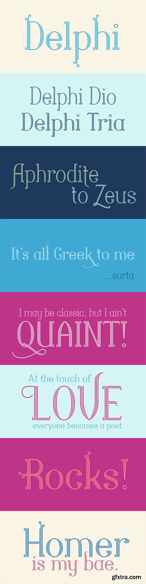
Delphi Font Family, 4xOTF with Webfonts $69
http://www.myfonts.com/fonts/positype/delphi/
- Delphi grew from a logotype Lily Feinberg produced using Greek-column-inspired letterforms. As that concept expanded to include more and more letters, the typeface had its beginnings. Intertwined, kinetic, and deliberate, Delphi carves itself onto the page and screen, encouraging variation and experimentation. The letterforms’ unique construction and predispostion for experimentation inspired two varying sets: Delphi Dio, comprised of two-line strokes, and Delphi Tria, built of both 2- and 3-line strokes.
- With a design as elaborate, yet tightly tuned as this, the desire to add more and more was irresistible—you'll see a number of stylistic, swash, and titling alternates (and even more hidden away in further stylistic sets). Because Dio and Tria could only hold so much, alternate cuts were produced to better organize your options: the Delphi Alt fonts feature certain letter styles and stylistic alternate sets distinct from those in Delphi.
- Delphi’s sophisticated, striking letterforms make it an ideal display face for use at large sizes, and with so many unique details and alternate letterforms, it’s simply fun to use.
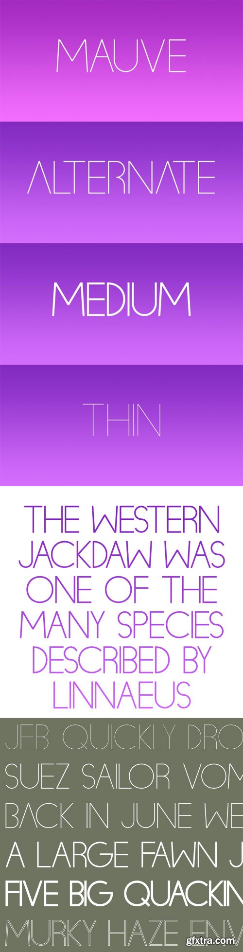
Mauve is a simple and fun display typeface.
http://www.myfonts.com/fonts/val-kalinic/mauve/
Ivory Font Family
Ivory is inspired by a beautiful typeface used in an illustrated compendium about pomology from 1882. We separated the elegant “Swashes” from the letters – use it together with “NoSwashes” to get two-colored initials. Please note that the kerning of NoSwashes works only together with Swashes. To achieve the two tone effect shown in the samples, you need to use an application that supports layers. For example, Adobe Illustrator, Adobe InDesign, Adobe PhotoShop, CorelDRAW, and Quark. Some of the preview images where made by Arina Karen Renata Palilingan.
OTF | 3 Fonts | JPEG Preview | 4.2 Mb RAR
Scout Font Family
Cyrus Highsmith drew Scout and related logotype for Geraldine Hessler’s redesign of Entertainment Weekly. The large family marks the magazine’s first significant typographic update in a decade. Captions and sidebars are set in Regular and Bold; Light, Black, and Condensed styles form the backbone of the display. Scout’s form derives structural elements from both new and old: DIN, Venus, and Cairoli. Among other uses, Scout is recommended for Newspaper, Magazine, Book and Corporate use.
OTF | 24 Fonts | JPEG Preview | 11 Mb RAR
Pincoya Black Pro Font Family
Pincoya Black Pro is a font based on lettering found on a poster from the Spanish Civil War, complemented with graphics developed in “La Unidad Popular” (Chilean political coalition) during the seventies. Pincoya has many alternate characters in Opentype format that provide multiple options when composing a text. It is an ideal font for high impact sentences, logotypes, magazine layouts, poster designs, etc. Languages include: Basic Latin, Western European, Euro, Catalan, Baltic, Turkish, Central European, Romanian and Pan Africa Latin.
OTF | 2 Fonts | JPEG Preview | 3.6 Mb RAR
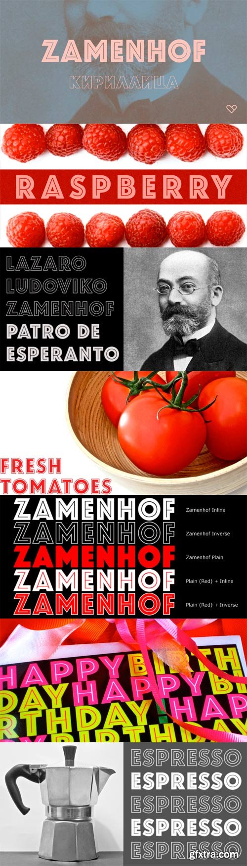
Zamenhof Font Family
Zamenhof is a family of five fonts that can be used singly or in combination to create a variety of bold, yet elegant, display styles. Inspired by Russian hand-lettering that appears to have been based on Jakob Erbar’s Phosphor, Zamenhof is essentially a Latin interpretation (with Cyrillic and Greek) of a Cyrillic interpretation of a Latin type design, with many changes along the way. (For example, all the Latin-only letters are quite different between the two designs: D, F, G, J, K, N, Q, R, S, U, V, W, Y, Z.) The Inline and Inverse styles of Zamenhof are the basic fonts and can be used effectively on their own. The Plain and Outline fonts — which I recommend using only in combination with the main designs — were created specifically to be combined with Inline and Inverse, as underlay and overlay layers, respectively. (You will need an application that supports layers, such as Adobe InDesign or Photoshop.) Zamenhof supports most European languages as well as modern Greek, and of course, Russian and other languages that use the Cyrillic alphabet. Needless to say, as Zamenhof is named after the father of Esperanto, it also supports Esperanto (as do all fonts from CastleType).
OTF | 4 Fonts | JPEG Preview | 4.1 Mb RAR
Supermolot Font Family
Supermolot is a modern square grotesk with the elements of the Soviet style. Supermolot is a logical continuation of the legendary Molot font that was developed in 2008 and has been free to download. Supermolot fontfamily has 10 fonts and support for multiple languages. It is a simple and affordable tool for any designer. All proceeds from the sale of fonts category “Super” are the creation of new low-cost and effective fonts.
OTF | 10 Fonts | JPEG Preview | 3.9 Mb RAR
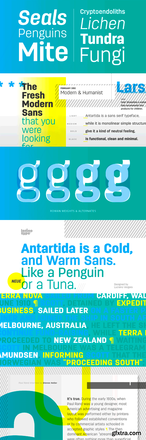
Antartida
Antartida is a sans serif typeface, while it is monolinear simple structure give it a kind of neutral feeling, is functional, clean and minimal. Is a family of 8 fonts, 4 weights and italics. This typeface contains alternate glyphs that help to emphasize text or headlines.
OTF | 8 Fonts | JPEG Preview | 3.6 Mb RAR
Centrale Sans Rounded Font Family
We are proud to announce the release of Centrale Sans Rounded, the rounded addition to Centrale Sans family. With Centrale Sans Rounded we've tried to make a difference - good looking typeface at a reasonable and affordable price. It comes in six weights plus their matching italics and the proper amount of OpenType features and glyphs.
OTF | 13 Fonts | JPEG Preview | 4.9 Mb RAR
Ephesus Font Family
This ALL CAPS font family comes in four weights, plus two additional styles-- outline and shadow. Ephesus is a great font to use when creating logos, posters, t-shirts, etc. “Ephesus” is named after the antique city in Izmir in Turkey.
OTF | 8 Fonts | JPEG Preview | 4.4 Mb RAR
Dharma Gothic Font Family
Dharma Gothic is an antiqued sans serif designed inspired by 1800s-style wood type. All glyphs had been designed carefully to be retro-looking of the old time and to fill all with nostalgia. This condensed font family with 42 styles will be the best solution for posters, titles and anywhere you need impact. To complete your work perfectly, Gothic Extras family is ready for free. They include borders, ornaments and frames designed using vintage catalog of Hamilton in 1800s as a model. Incidentally, g, r and y have alternative glyphs that are available with the OpenType salt feature and tabular figures are available with tnum feature.
OTF | 46 Fonts | JPEG Preview | 5.7 Mb RAR
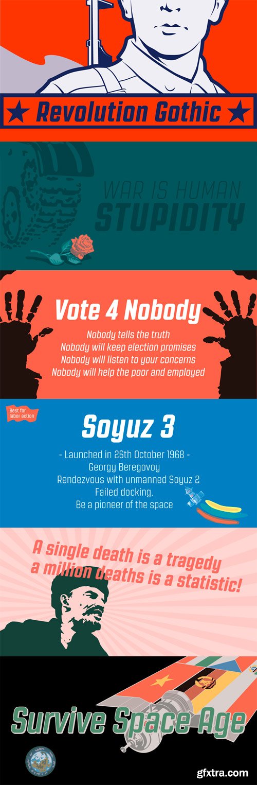
Revolution Gothic Font Family
This font family is an arranged and extended version of PAG Revolucion released from Prop-A-Ganda type foundry in 2008. The original font is inspired by retro propaganda posters and wallpainting in Cuba from the 60s to 80s. And the original PAG Revolucion is the most popular font from Prop-A-Ganda. In redesigning this font, their detail and spacing was modified and new weights with matching slanted and also lowercase in each style were added to fit contemporary design needs. Then, Revolution Gothic became big family containing 10 styles and will be perfect family for your retrospective project.
OTF | 10 Fonts | JPEG Preview | 6.1 Mb RAR
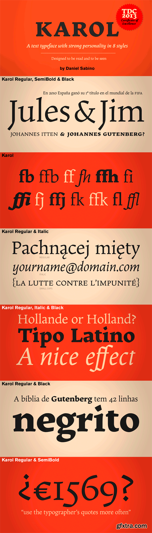
Karol Font Family
Karol was designed in 2011 as a project in the MA in Advanced Typography from EINA/UAB, in Barcelona. It was born as text typeface inspired by the work of East European type designers. Two years later, Karol is ready for public release, in a collection of eight styles (four weights and matching italics) with high readability, strength and character. A few days before its publication, we received the news that Karol had been awarded the Certificate of Typographic Excellence (Judges’ Choice) of the Type Directors Club.
OTF | 8 Fonts | JPEG Preview | 8.1 Mb RAR
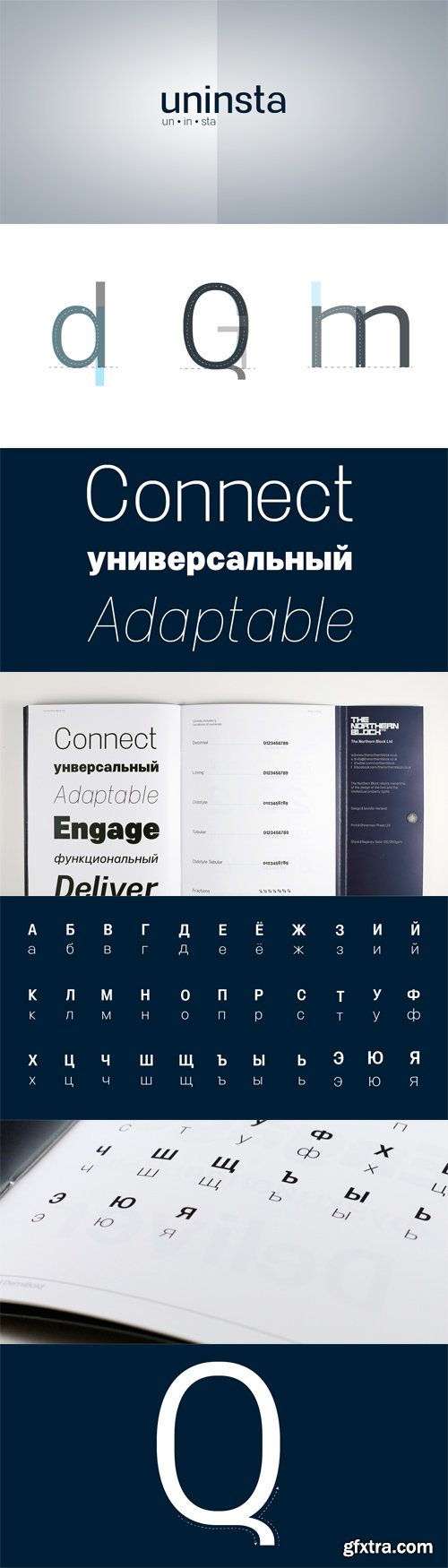
Uninsta Font Family
Uninsta is a neutral sans serif font family intended for use across a variety of modern applications in both digital and print media. Geometric letter forms are combined with subtle humanist touches to create a legible, low contrast typeface with great personality. Details include 9 harmonised weights with true italics, over 490 characters, alternative lowercase ‘a’ and uppercase ‘Q’ with associated accents, manually edited kerning and Opentype features.
OTF | 18 Fonts | JPEG Preview | 5.2 Mb RAR
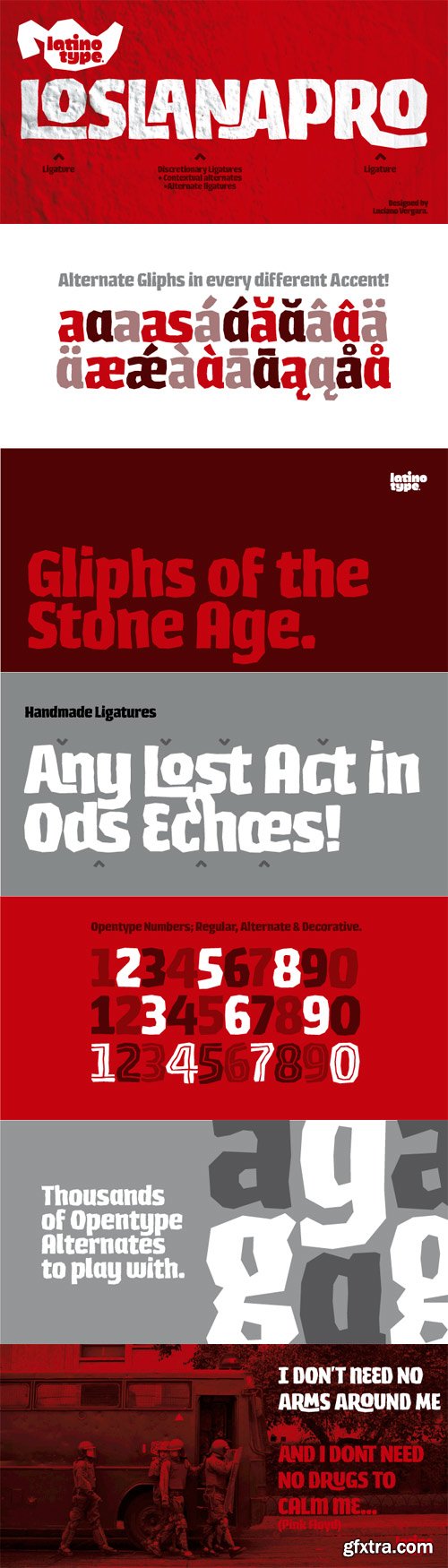
Los Lana Pro Font
Los Lana Pro is a handmade display typeface. Unlike other font families, this type has not a modular structure, that is, each character has been individually designed. The coherence of structure elements across different characters is given by irregular strokes. This curveless typeface is perceived as being curved because of its straight lines, which form different-size angles. Los Lana Pro is a rustic typeface that captures the stereotypical “Andean hippie” handmade aesthetics. Irregular shapes and broken lines give it a distinct personality. Los Lana Pro looks better in larger sizes. Includes many ligatures, two groups of alternate characters, and titling caps characters. Languages include: Basic Latin, Western European, Euro, Catalan, Baltic, Turkish, Central European, Romanian and Pan Africa Latin.
OTF | 1 Font | JPEG Preview | 4.6 Mb RAR
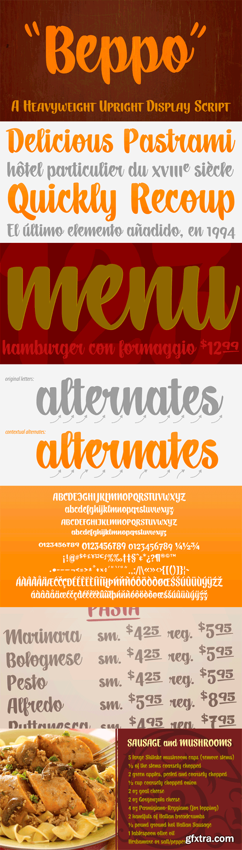
Beppo Font
Beppo is a bold upright casual script with a condensed character width and a full palette of ordindals, small caps, and diacritics. Beppo flavors things up with old style figures and quirky, contextual alternate connections. Legible, compact and smothered in typographic cheese - it just smells good!
OTF | 1 Font | 4.3 Mb RAR