Following the success of our LoveHearts, valentine inspired ornaments, we decided to show our love for Christmas. With more than 170 hand drawn unique designs, LoveChristmas is the perfect choice for designing Christmas greeting cards and gift wraps as well as letter signatures and accessories.
Tawasul is an Arabic typeface inspired by folkloric arts. The Letter forms were derived from Naskh style, with the effect of penmanship. The font is developed for design projects which require a spontaneous and unprompted impression.
OTF | 1 Font | JPEG Preview | 4 Mb RAR
Dimensions is redesigned font family based on Blackout font released as free font in 2005. The original blackout has been used especially for company or brand logo of fashion and music label in the world. In 2011, Blackout had evolved into this Dimensions font family of seven weights with roman and italics. They are one of the most condensed, black and skinny font in the world. All weights and italics have upper and lower cases, accented characters and small capital glyphs that can be used with OpenType smcp feature.
OTF | 14 Fonts | JPEG Preview | 3.6 Mb RAR
CRR NTN regular and outline, is a futuristic font family. It works well as an identity logo type and 3D work. Together using the outline and the regular font, you can create endless combinations.
TTF | 2 Fonts | JPEG Preview | 3.3 Mb RAR
A free-flowing brush script with only uppercase letters. Now with a professional and multilingual character set! Vic Fieger says: "The letters in Edo were hand-drawn using a thick black permanent marker with a flat head. The head was chopped up using a box cutter to create a “brush” effect. The entire font was made while watching Bobobo-bo Bo-bobo. Edo has been used by video game-makers UbiSoft in their game adaptation of the 2007 animated film Surf’s Up, as well as ads for the Fuse 2006 Warped Tour. More recently, it has turned up in such places as the cover for the US release of the manga Teru Teru x Shonen, and the logo for A&E’s program, “The Cleaner.”
TTF | 1 Font | JPEG Preview | 4.6 Mb RAR
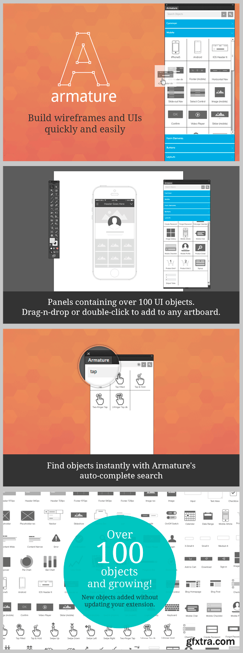
Adobe Illustrator CS5+ | ZXP | 3.2 Mb RAR
Build User Interfaces Fast in the Tool You Already Design in!
Armature is the ultimate wireframing extension for Adobe Illustrator. Conceptualize web and mobile layouts quickly and efficiently by simply adding objects to any artboard. Armature’s well-organized, fully searchable library contains headers, footers, menus, tabs, toggles, tooltips, placeholders, content blocks, form elements and even complete layouts—the list goes on.
• Installs in seconds
• Double-click or drag-n-drop any object
• Fast auto-complete style search—find any object in the library quickly
• New objects being added all the time—no need to update...new objects appear automagically!
Panels include:
• Common Elements – headers, footers, content blocks, placeholders, graphs and lots more
• Mobile Objects (at retina size) – everything you can imagine to build mobile views quickly
• Form Elements – inputs, selects, sliders and even fully formatted forms
• Layouts – complete layouts including blogs, ecommerce, portfolios, sign-ins, calendars and tables
For web objects, Armature also conforms to the Twitter Bootstrap grid but can represent virtually any layout. Compatible with Adobe Illustrator CS5, CC and CC 2014.
25 EPS | + JPEG Preview | 194 Mb RAR
Wood Bonnet Antique No.7 is based on real vintage wood type blocks from Switzerland. The very distressed letters give a warm analogue vintage charm on printing. These kind of wood type letters were very common and often named by generic names like Roman, French or Antique followed by a catalog number. But these letters have some very quirky details hard to find else were. The font offers up to four glyph variations of all the Latin base letters, figures and some additional letters. An OpenType glyph-rotator is programmed to emulate the randomness of old school printing on live typing. All dingbats of the specimen file are included in the font data too.
OTF | 1 Font | JPEG Preview | 6.3 Mb RAR
Brilliant is a modern antiqua typeface that includes three weights. It is both very readable and easy to cut. The corners in the typeface makes it easy to cut, but doesn’t disturb the readability. Brilliant is perfect for big sizes, headlines and characterful sublines.
TTF | 3 Fonts | JPEG Preview | 3.6 Mb RAR
Morning Glory inspired from Victorian age, take a culture of fashions, politic and art its really great font for your band, company, label, clothing company, vintage or classic stuff, etc.
OTF + TTF | 1 Font | JPEG Preview | 3 Mb RAR
Now my feelings about didones are more than evident. After some years of roman-abstinence (1) I present Heroe, an interesting combination of elegance and sensuality. Heroe, spanish for hero, takes some aspects of roman typefaces to the extreme like my main inspiration, the great Herb Lubalin, did in the majority of his works: Thins turned into hairlines, altered proportions (for display purposes), unique ball terminals, poetic curves and a graceful way of placing them together on a layout. Its classy style makes the font perfect for a wide range of uses. Imagine Heroe Inline (my favorite) dancing over a bottle of perfume; printed on the cover of a fashion magazine; lighting wedding invitations up. Its partner, Heroe Monoline, may help you to make more elaborated pieces of design. Just combine it with Heroe, or Heroe Inline and see how perfect they match. The difference between Pro and Std styles is the quantity of glyphs. While Pro styles have all the decorative characters available, Standard ones have only the basic set of them. Heroe Monoline Big and Heroe Monoline Small where made for better printing purposes. If you need to print the font in small sizes, then your choice should be Small. Heroe Monoline has the same alternates (and open-type code) as Heroe Pro and Inline, plus some decorative ligatures.
OTF | 5 Fonts | JPEG Preview | 4.2 Mb RAR
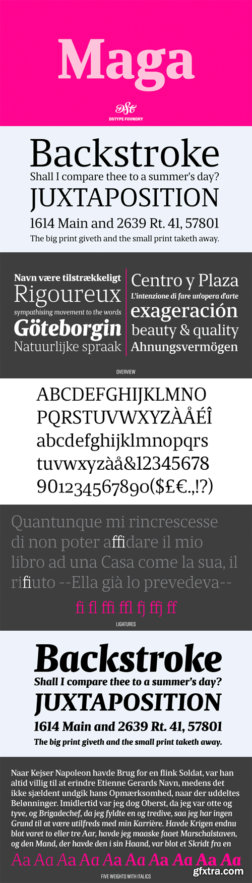
Maga shares the skeleton with one of our first typefaces (Quaestor, from 2004), but we didn't want to simply expand an existent design, so we took a step forward—not just with improved features and new weights, but also making the italics more usable than its predecessor. The balance between the counters and the space between letters makes this a very space-saving typeface with plenty of legibility, yet stylish enough for contemporary magazine design.
OTF | 10 Fonts | JPEG Preview | 4.6 Mb RAR
It was in the beginning of 2008 when I designed a font named Quijote, its predecessor. In the middle of 2009, I looked at it again and thought it could be a good idea to make an update of it. Variables and Features: Quijote Sauvage Pro is the most complete variable. It includes all the ligatures, alternates and swashes. It has the OpenType function in order to alternate glyphs easily when running applications which support this. The font is also offered separately. Quijote Sauvage Standard has the right glyphs to get an equilibrium between wildness and softness. It includes standard and discretionary ligatures. Quijote Sauvage Stylistic has the sharpest glyphs. Its decorative traces are discreet in order not to have problems as regards legibility. Its upper case are less wild than the other variables. Quijote Sauvage Text is the most discreet of its partners. This one was thought in order to improve legibility. Its ascenders and descenders are shorter, so the words are easier to read in small sizes. Quijote Sauvage Contextual, Swash and Titling, are the ones with wonderful terminals. They decorate words, adding a wonderful look of wildness or passion.
OTF | 8 Fonts | JPEG Preview | 4.7 Mb RAR
Colfax is a refined oval sans serif of 20th century origins and 21st century sensibilities. Influences ranging from the gruff Aurora Grotesk series to the elegant Neuzeit are paired with a subtle geometry and typographic utility to inform this family of sans serifs. Featuring a range of six weights with accompanying italics, the entire Colfax family is made up of twelve fonts. At the extreme ends of the range are two display weights – Thin and Black – supported by four workhorse weights – Light, Regular, Medium and Bold. When designing Colfax’s weight range, we followed our standard policy: create truly useful weights rather than what is mechanically possible. As such, each weight can be used with another two up or two down in the range to maintain contrast between the two. For instance, Thin can be paired with Regular or Medium paired with Black. This isn’t prescriptive, of course, but offers a rational starting point for a typographer first experimenting with Colfax. The conventionally round or semi-oval characters of Colfax are comprised of subtle straight sides and near perfect circles. We think of this as implied geometry. It isn’t measured or automatically repeated for all characters but instead referenced throughout the typeface creating a pleasant, family-wide gestalt. Although so-called true italics are often paired successfully with sans serif designs, they simply didn’t match Colfax. Oblique, adjusted italics were drawn instead to match the starkness and gravity of the roman. True to its minimalist roots, Colfax has just one alternate: the uppercase J. Found as an OpenType Stylistic Alternate, its horizontal cross bar at cap height makes it ideal for double J headlines like JOJOBA or JUJITSU. We love arrows so it’s only natural Colfax features a collection of left and right directional arrows in all six weights to point the way. The arrows are available in two sizes – one for caps and another for lowercase.
OTF | 12 Fonts | JPEG Preview | 6.3 Mb RAR
Let's meet Thander! A round bold script that really brings the classic and personal feel to life. Thander is a combination between brush lettering and speed writing. It is thick, tight, and have irregular shapes to make it feel much more personal. Use it in your lettering project, display, headline, branding, logo or any vintage design styles such as hipster badges or insignias.
OTF + TTF | 1 Font | JPEG Preview | 3.8 Mb RAR
Customize your alternates! Mandinor FY is a victorian modular family of 3 different typefaces very contrasted: Modern, Gothic & Italian. Perfect for headlines and any other titling creations, this font family feels very good when used in super poster size. Ornaments, letters (and even animals (miaou)!) can be mixed all together to build original alternates. Now its on you to play and build your own glyphs! Mandinor FY was created by Julien Priez & Fontyou Team on co-create.fontyou.com, the first collaborative type foundry.
OTF | 4 Fonts | JPEG Preview | 4.9 Mb RAR
Canada Type is a digital type solutions company based in Toronto. We were founded in 2004 by Rebecca Alaccari and Patrick Griffin, as a means to perform professional type solutions to creative indviduals and departments all over the world. Since then, Canada Type has brought forth a comprehensive and popular library of typefaces that accommodate a variety of aesthetic tastes. Alongside Rebecca's and Patrick's original designs and historical revivals, the Canada Type library features typefaces by eminent American calligrapher Philip Bouwsma, Dutch science writer and lifelong type enthusiast Hans van Maanen, American expat writer and classicist Bill Troop, and Canadian type designer Kevin King. We also perform project-specific type solutions to a variety of clients, including large publishing houses, telecom and media companies, film production studios, design agencies, ad firms, and government agencies. Among our clients are instantly recognizable names like the BBC, Disney, ABC, Pixar, New York Times, Newsweek, Wall Street Journal, MacLeans, Bell Canada, Rogers, Rethink, Reactor, Leo Burnett, Shaw Communications, Cafe Press, Sobeys, the Canadian Ministry of Transport, the Canadian Armed Forces, and the Vancouver 2010 Winter Olympics. The Canada Type font packages are available for licensing and secure electronic delivery through this site and a variety of quality type distributors worldwide.
OTF + TTF | 225 Font Families | 84.7 Mb RAR
CreativeMarket 117760 - Magazine Bundle 3
Adobe InDesign CS4+ | INDD Files | 117 Mb RAR
"Ahlan" is a an Arabic typeface with an individual anatomy based on common hand writings, reshaped and reconstructed to meet the new media demands. It suits short passages, poetry, corporate greetings beside other applications. Font family consists of Regular, Italic, Bold and Italic Bold weights.
OTF | 4 Fonts | JPEG Preview | 5 Mb RAR
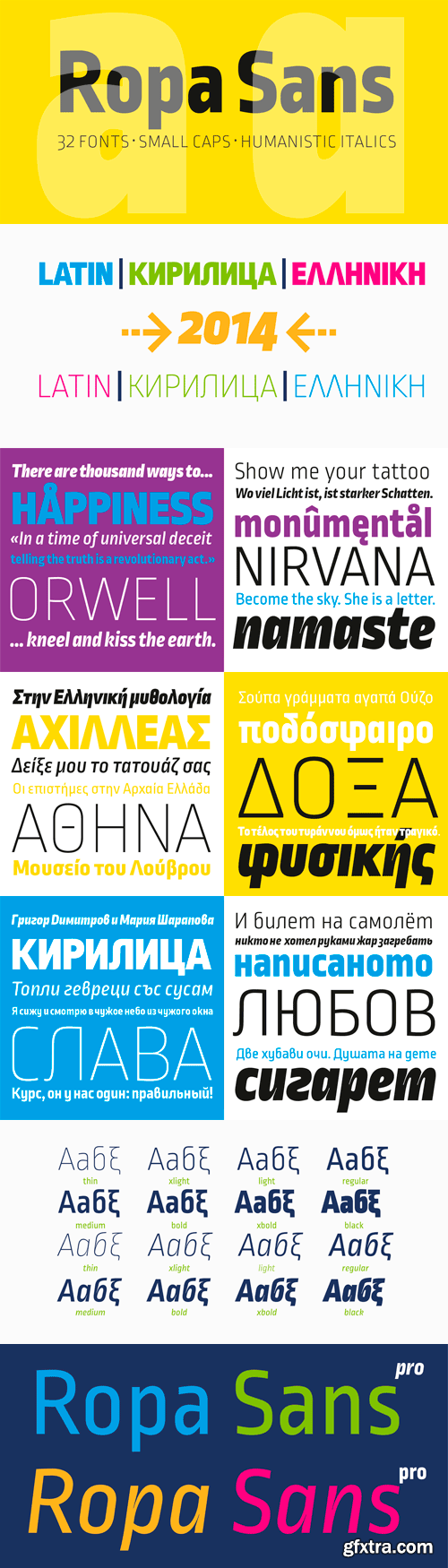
Ropa Sans Pro Font Family
Ropa Sans Pro is a sans serif font family of 8 weights plus extra designed italics and small caps. While the upright styles pay a distant homage to the technical aesthetics of the early-20th century DIN series, the strongly humanistic italics breathe in quirky freshness and create a unique flavor. Four styles (Ropa Sans, Ropa Sans SC, Ropa Sans Italic and Ropa Sans SC Italic) are available free of charge. Suitable for both body and headline use, Ropa Sans Pro provides advanced typographical support with features such as case-sensitive forms, fractions, super and subscript characters, and stylistic alternates. It comes with a complete range of old style and lining figures, witch are in tabular and proportional widths. In addition to an extensive coverage of Latin-based languages, Ropa Sans Pro provides essential support for the Cyrillic and Greek writing systems.
OTF | 32 Fonts | JPEG Preview | 4.2 Mb RAR
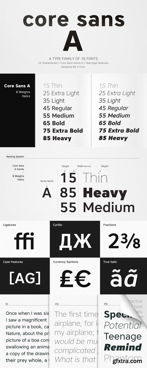
Core Sans A Font Family
Core Sans A Family from S-Core is a modern sans-serif typeface that is clean, simple and highly readable. It is a part of the Core Sans Series (Core Sans N SC, Core Sans N, Core Sans NR, Core Sans M and Core Sans G). Letters in this type family are designed with genuine neo-grotesque and neutral shapes without any decorative distractions. The spaces between individual letter forms are precisely adjusted to create the perfect typesetting. Core Sans A family consists of 8 weights (Thin, Extra Light, Light, Regular, Medium, Bold, Extra Bold, Heavy) with their corresponding italics. Core Sans A contains complete Basic Latin, Cyrillic, Central European, Turkish, Baltic character sets. Each font includes proportional figures, tabular figures, numerators, denominators, superscript, scientific inferiors, subscript, fractions and case features. We highly recommend it for use in books, web pages, screen displays, and so on.
OTF | 16 Fonts | JPEG Preview | 4.7 Mb RAR